During my internship, I worked on improving how Visier users send an analysis by email. A new conditional send feature was recently added to the experience and my task was to assess the user experience and update the visual design to match the latest design system. I worked with my manager, the Solutions UX team, and a developer to iterate, implement, and determine next steps for the experience.
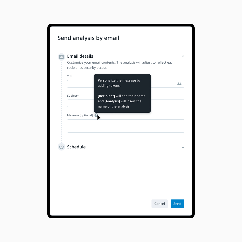
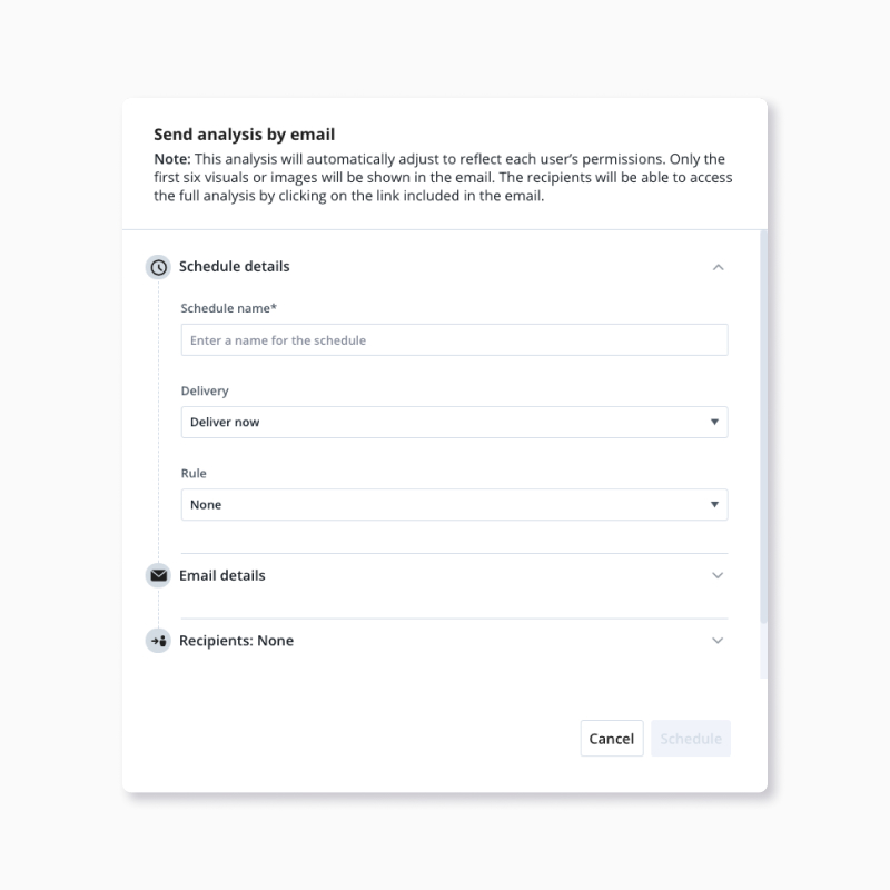
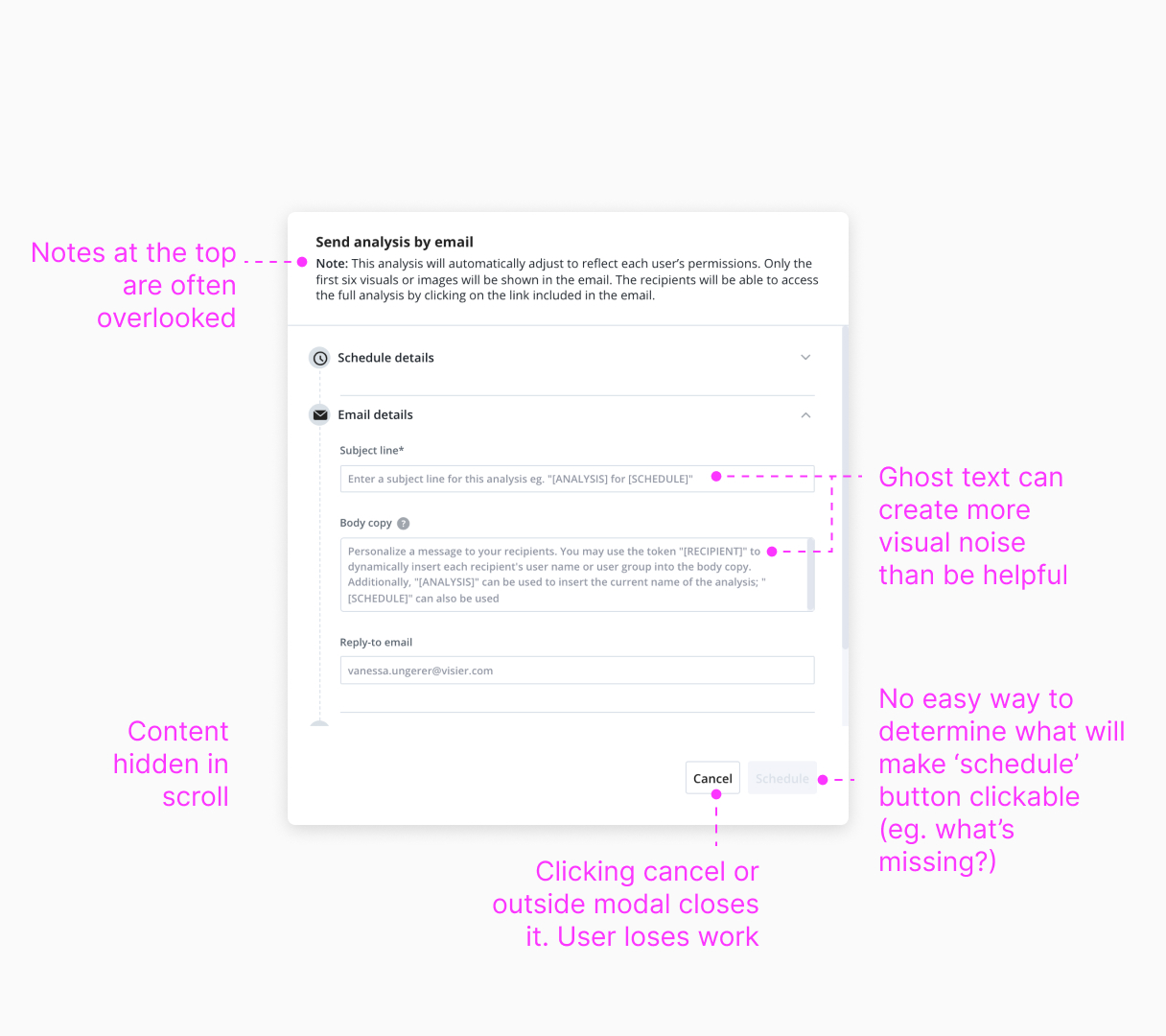
Original send analysis by email experience
Project goals
- Test UX for the new conditional delivery feature
- Identify pain points for the experience and provide recommendations for improvement
- Update UI to match the design system, creating a more cohesive experience
Scope
- Research
- Facilitation
- Prototyping
- Interaction design
- Visual design
- QA
Guiding design principles
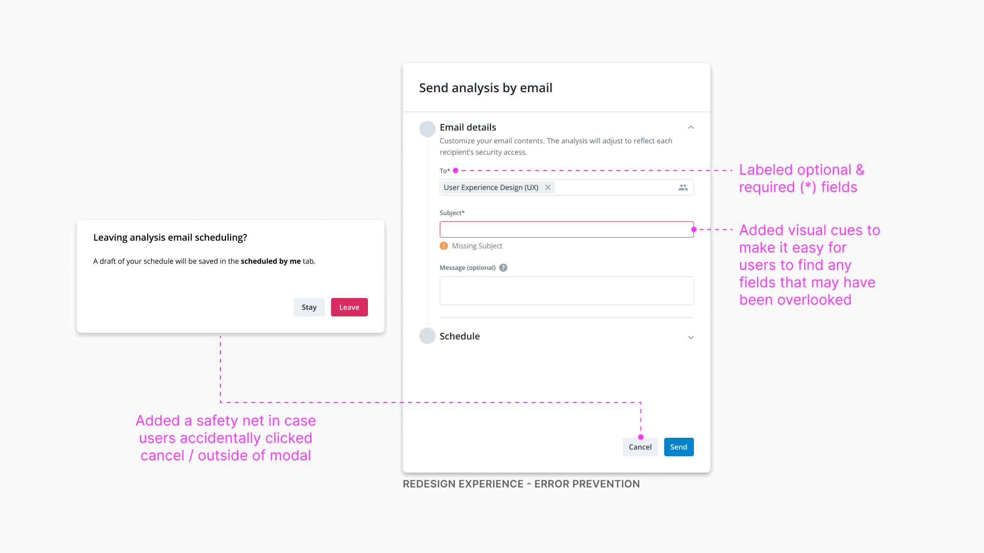
- Error prevention - The form should be presented in a way that is easy to navigate and is obvious what input fields are required. Accidentally clicking cancel or outside of the modal should not cause users to lose work.
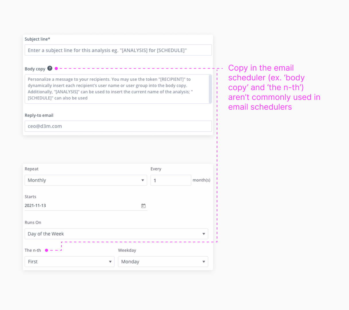
- Familiar copy - The copy should be familiar, concise, and easy for users to understand.
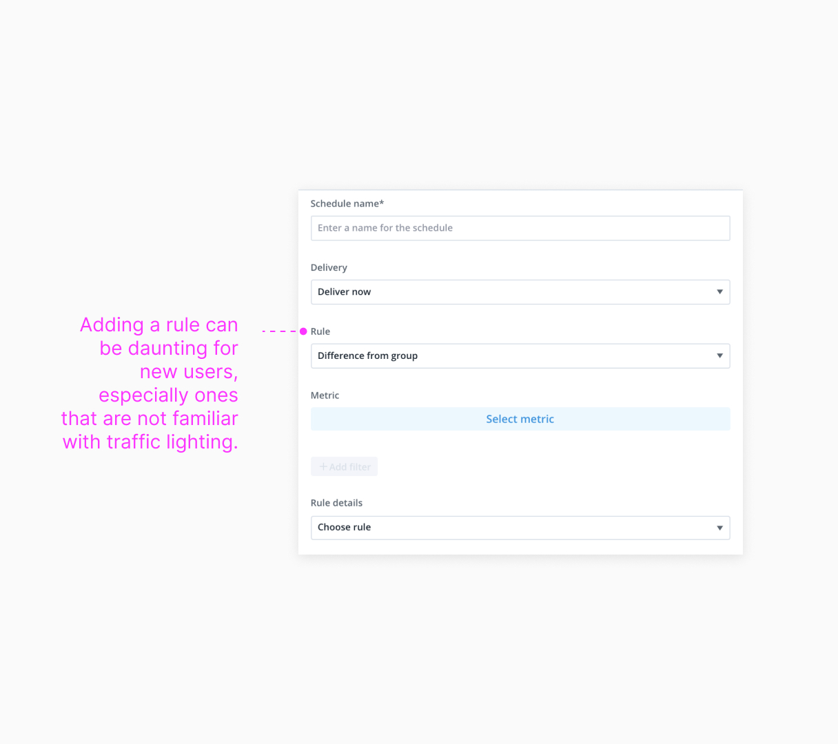
- Approachable to all users - Analysis email scheduling should be easy to use for all user personas. Analysts benefit from email scheduling by sending analyses that empower decision makers, power users share findings, and general consumers can use this to monitor KPIs.
 Design principles in the current experience
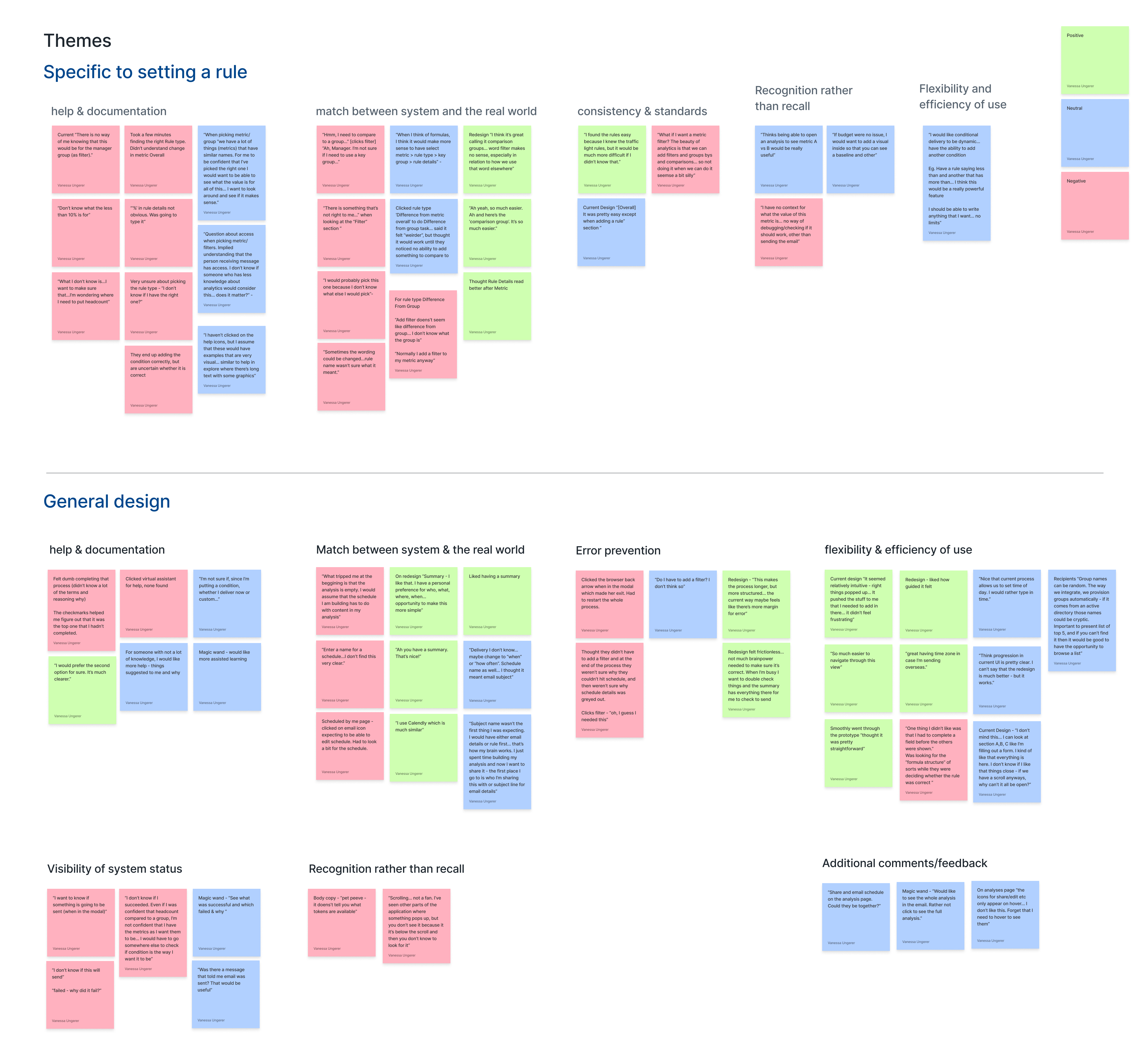
User pain points
I recruited five internal users and facilited usability test sessions to uncover pain points in the current design.
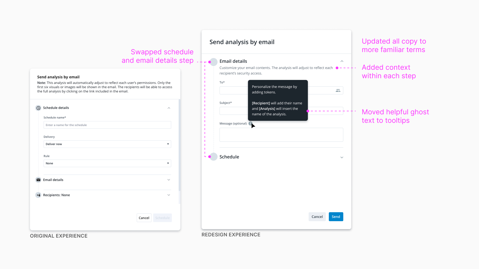
- The flow of did not match mental models of sending an email - People expressed that the current flow of sending an email was confusing. They first wanted to input WHO they are sending the email to, then WHAT they are sending, and finally shedule WHEN they wanted the email to send.
I just spent time building my analysis and now I want to share it. The first place I go to is who I’m sharing this with or subject line for email details
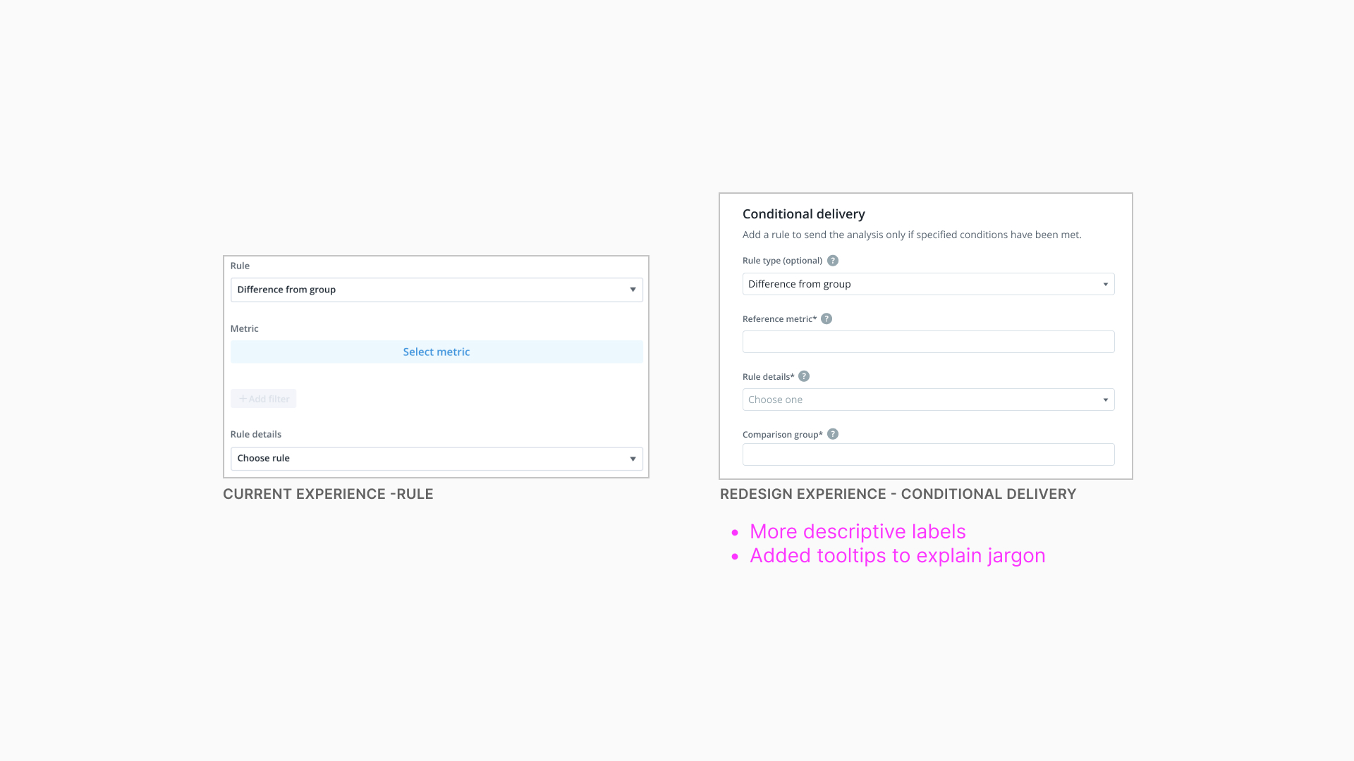
- Novice users struggled to complete inputs - Many participants who were new to using the email experience questioned what certain input fields such as ‘rule’ were asking them for. This slowed down their ability to complete the task.
I felt dumb completing that process - I didn’t know a lot of the terms and reasoning why
- Setting a conditional delivery experienced the most friction - 40% of participants said that they did not feel confident that they successfully completed their task to input a conditional delivery. They wanted more support.
I don’t know if I succeeded. I’m not confident that I have the metrics as I want them to be. I would have to go somewhere else to check if the condition is the way I want it to be
I looked at other platforms to see how they design forms and email schedulers
-
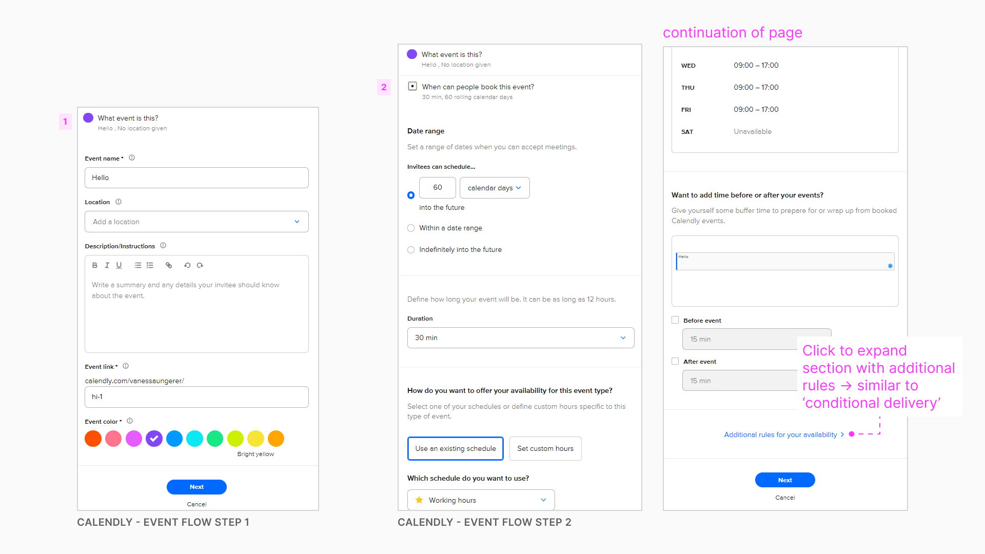
It’s common to break a complex task into multiple steps - The current scheduler is a long form fit in a small space, with much of the content hidden in a scroll. When thinking about other complex tasks, Checkout Experiences came to mind as they are often chunked into manageable portions to complete. Often, divided into pages for order summary, shipping, delivery, payment, and review. Reducing the number of questions asked at once makes these tasks appear more manageable.
-
Differentiating required vs optional fields - A common pattern found to communicate required vs optional fields was to mark * and (optional) for each input.
-
Scheduling tools follow a somewhat standard flow - Gmail, Outlook, Calendly, and Mailchimp follow similar user flows of completing the contents (eg. recipiencts, subject, message) before creating a schedule.
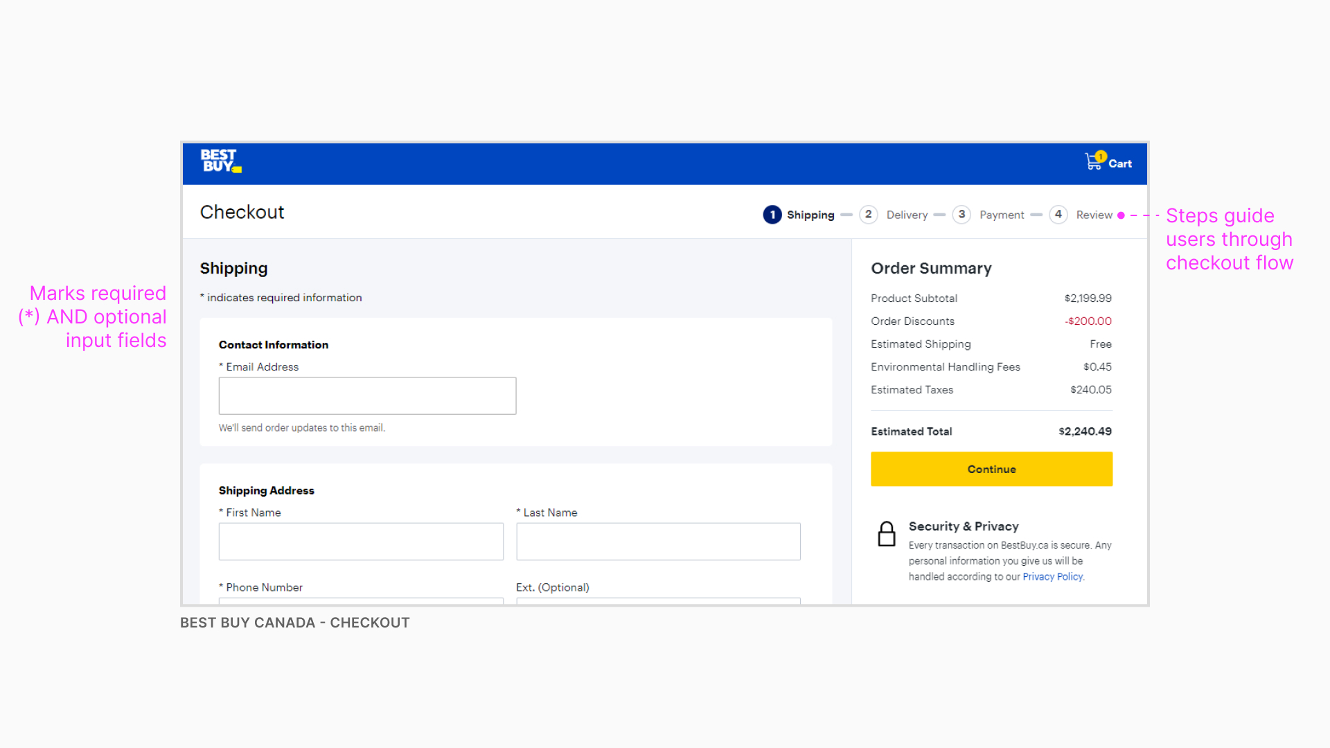 Example of Best Buy checkout experience
 Example of creating an event in Calendly
The solution
By understanding user pain points and priorities we were able to create a solution where user testing participants
✅ Made less errors
✅ Decreased time on task
✅ Higher task success rate than the current design
I had the opportunity to present this project to over 100 people at Visier. During my internship, recommendations for the conditional delivery workflow were implemented in the app, including making the copy clear and easy to understand, changing the order of steps to match users expectations, and adding more context to support users with complicated tasks.
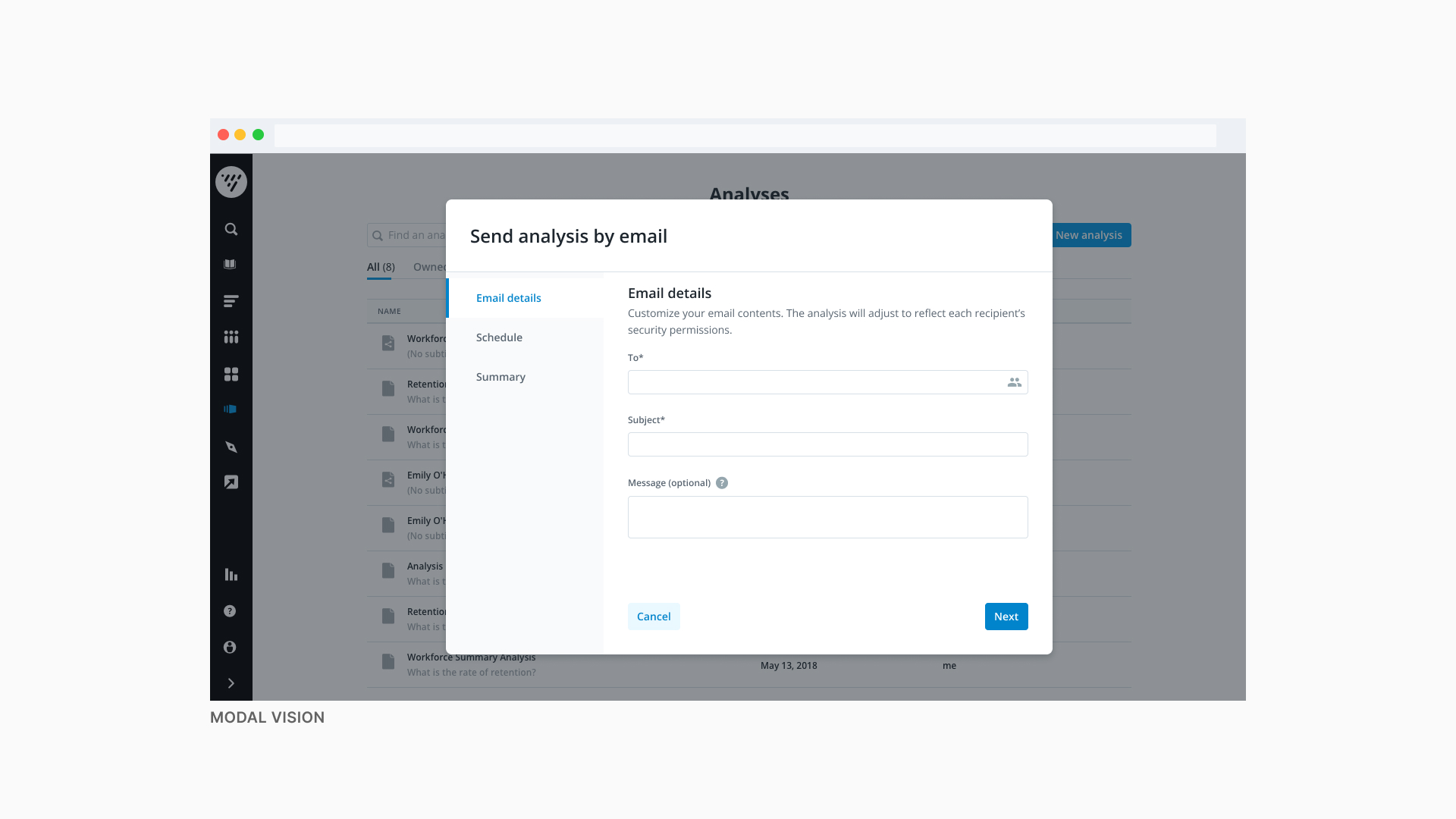 Modal vision
A vision for the modal design used our new design system colours and type. It also moved steps to the left side panel, a pattern that is already being used in other parts of the app.
Final thoughts
Create positive moments by empathising with users - The email experience was enhanced as a result of testing the workflow on users, gathering feedback, and iterating the design.
We can make workflows easier by leveraging better design patterns - A problem found with the current drawers pattern was that it’s easy to make mistakes. Information is lost in a scroll making it difficult to see the contents of each step. By leveraging an improved design pattern - a wizard - I was able to separate the complex workflow into small and manageable tasks to help users easily go through each step.