The problem was that storyhive.com was no longer fit for purpose. It was designed when SH only had a few funding opportunities available, and since expanding its offerings, business and user needs had outgrown the website. Their 10 year anniversary was also coming up and they were ready for a website refresh!
My role
I was contracted by Untangle UX, a local design agency, to work on two projects:
- Visual designer for STORYHIVE (SH) and TELUS Originals service blueprints
- User experience design for storyhive.com pre-authentication screens
Content audit, design exploration, design system, prototyping, handover report
Team
- SH stakeholders from product, marketing, programs, and content
- Principal experience designer from Untangle
- User experience designer (me)
Website design approach
To kick off the project, we met with stakeholders and had them walk us through their website. Talking through each page helped us learn more about SH, and pin-point business objectives, motivations, pain points, and positive moments in the experience.
Our knowledge of the audiences we were designing for gained from the previous engagement (survey and interview research) was an asset as we had a good understanding of user objectives, motivations, pain points and positive moments.
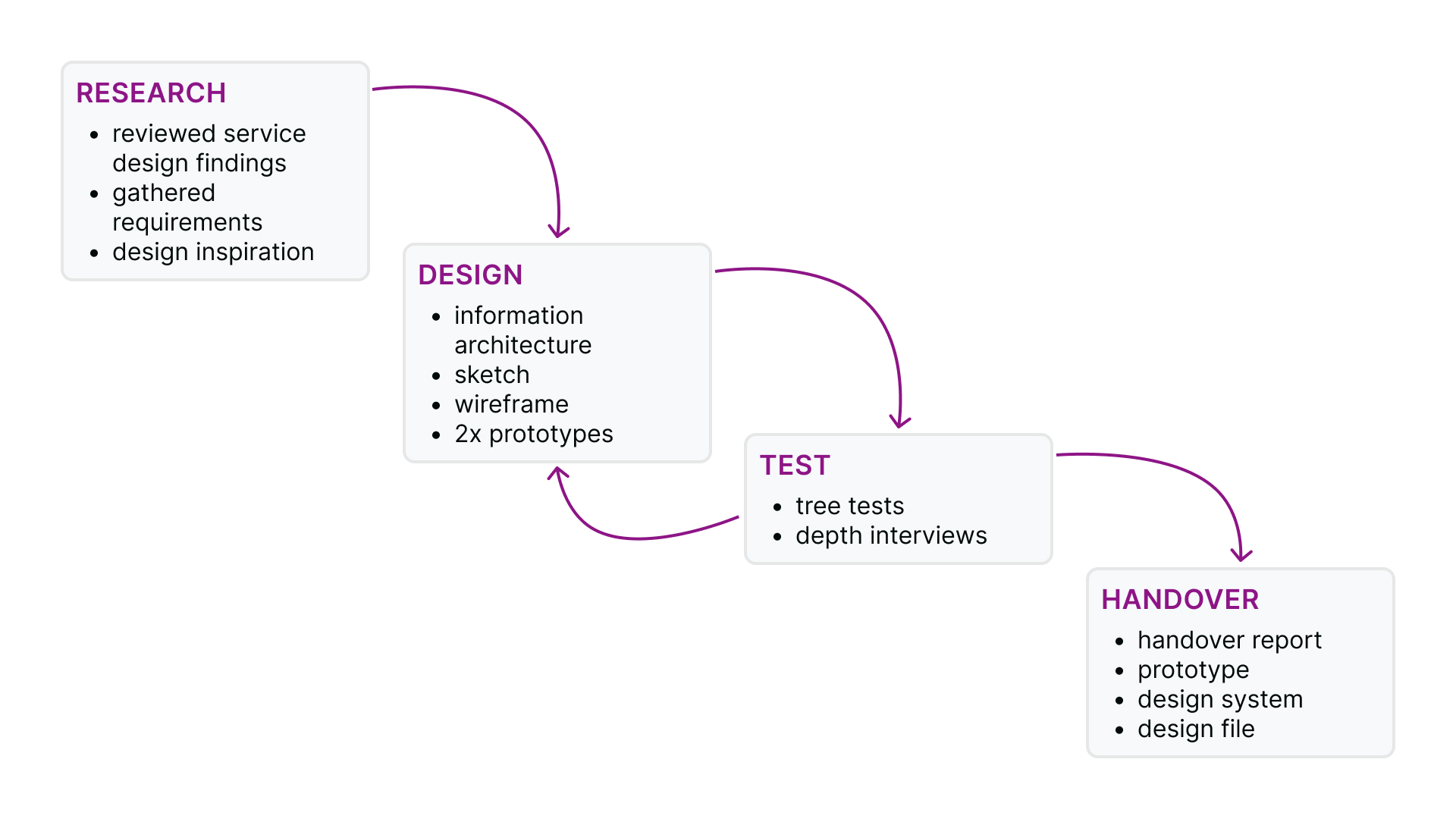
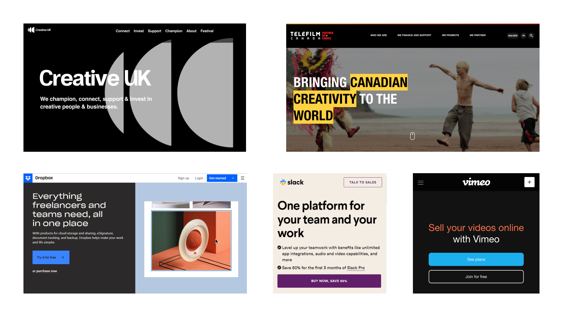
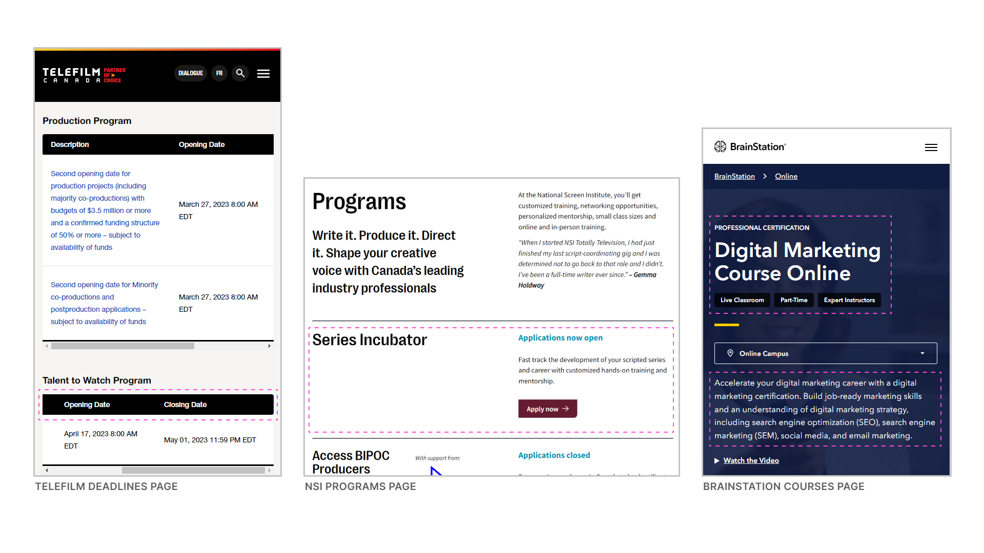
During the design process, I explored the previous research and looked for inspiration of what other companies do to solve similar problems. The designer I collaborated with created a new information architecture, providing order and structure to the new website before I started wireframing. I completed two rounds of wireframing (grayscale and high-fidelity), whilst my colleague tested the new architecture and designs with users. With each iteration, I took the data gained from testing to improve the design.
Expectations
- Final handover report with design files and prototypes
- Two month contract
- Weekly stakeholder meetings to share findings and gather feedback
- No design system to work with, only branding assets
User journeys
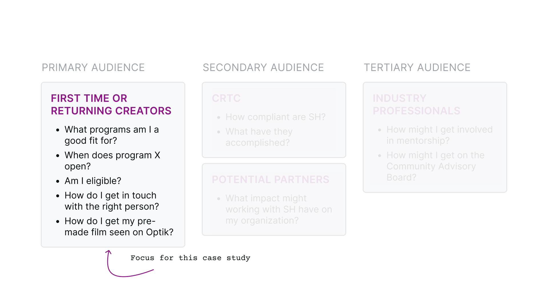
We had primary, secondary, and tertiary audiences to consider when designing. We grouped our research into specific tasks each user group wants to accomplish when visiting the website. These tasks gave us a clear idea of what we would focus on when designing.
In this case study, I will share two content creator user journies and their design recommendations which at the time of writing this have been implemented on the SH website.
As a content creator with no experience, I want to learn about SH programs, so that I can make an informed decision about which programs to apply for
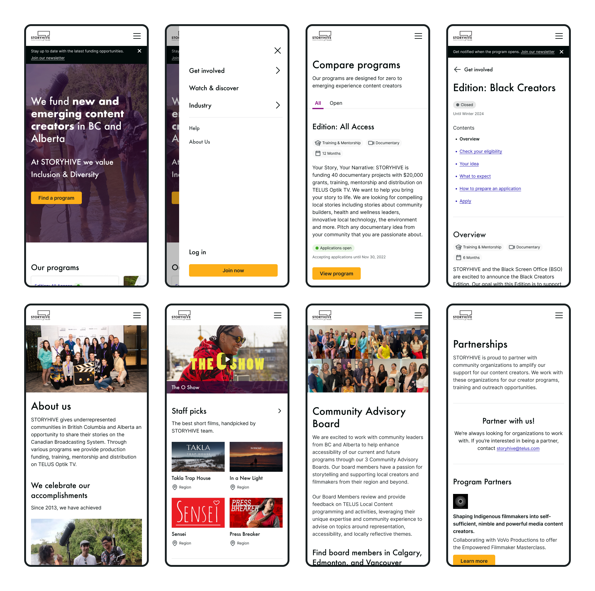
Home
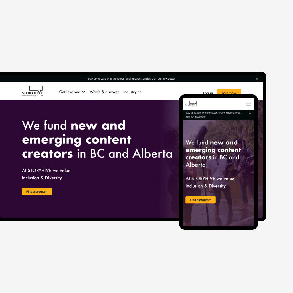
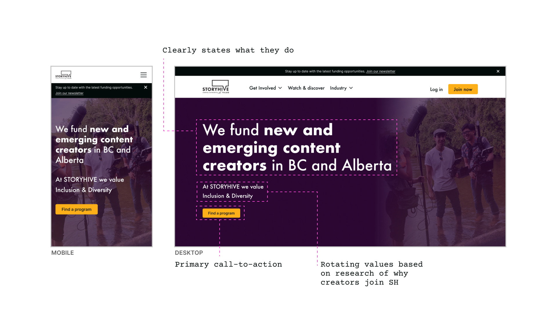
With a majority of visitors interested in funding opportunities, we looked at making this the primary call-to-action on the site. Starting with the homepage, we redesigned the hero section to clearly state what SH offers and include key value propositions based on user research of why creators join the programs to draw visitors in to ‘find a program’.
During user testing, a creator mentioned that they expected to see a background image that they could connected with, so I updated the hero to show a ‘behind the scenes’ shot. When the creator saw the final iteration they instantly knew they were in the right place.
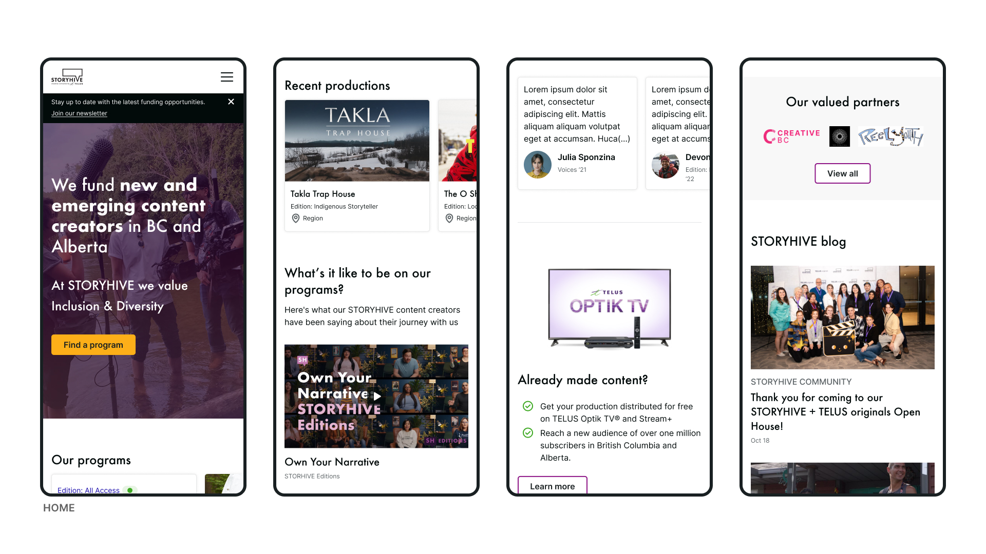
Other updates to home included ‘our programs’ to showcase the programs and their status, content creator testimonials and another access point to Optik TV.
Find a program
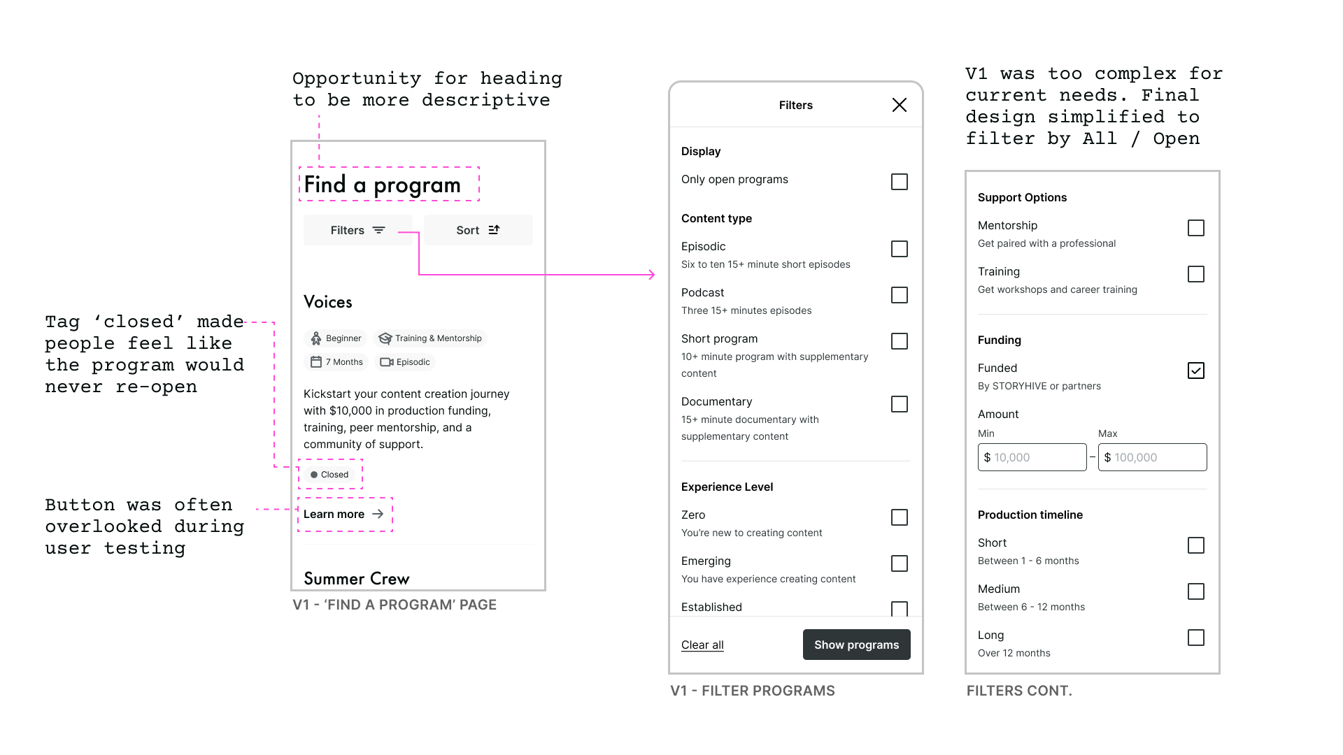
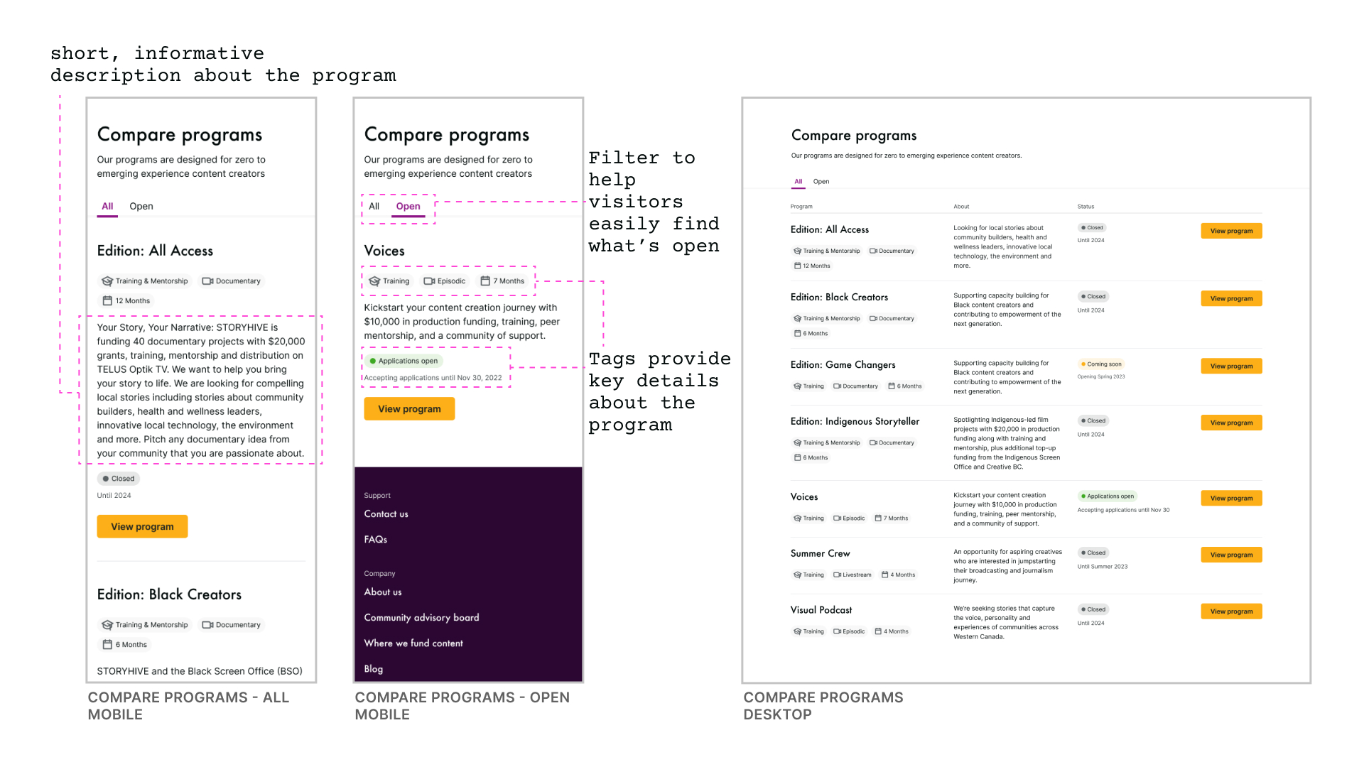
Many creators found it difficult to determine what programs they would be a good fit for. It was also difficult to determine what programs were open. In the new design, we consolidated all programs into a single page, provided a brief description and tags to give visitors an at-a-glance view of programs before deciding if they wanted to click in to learn more. During user-testing, we found that seeing ‘applications open’ was a delight moment for many participants. Participants also engaged with the new ‘open’ filter.
Compare programs inspiration
Compare programs iteration 1
Compare programs redesign
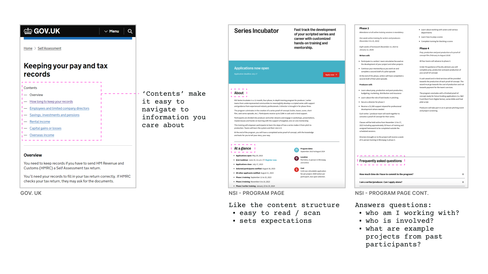
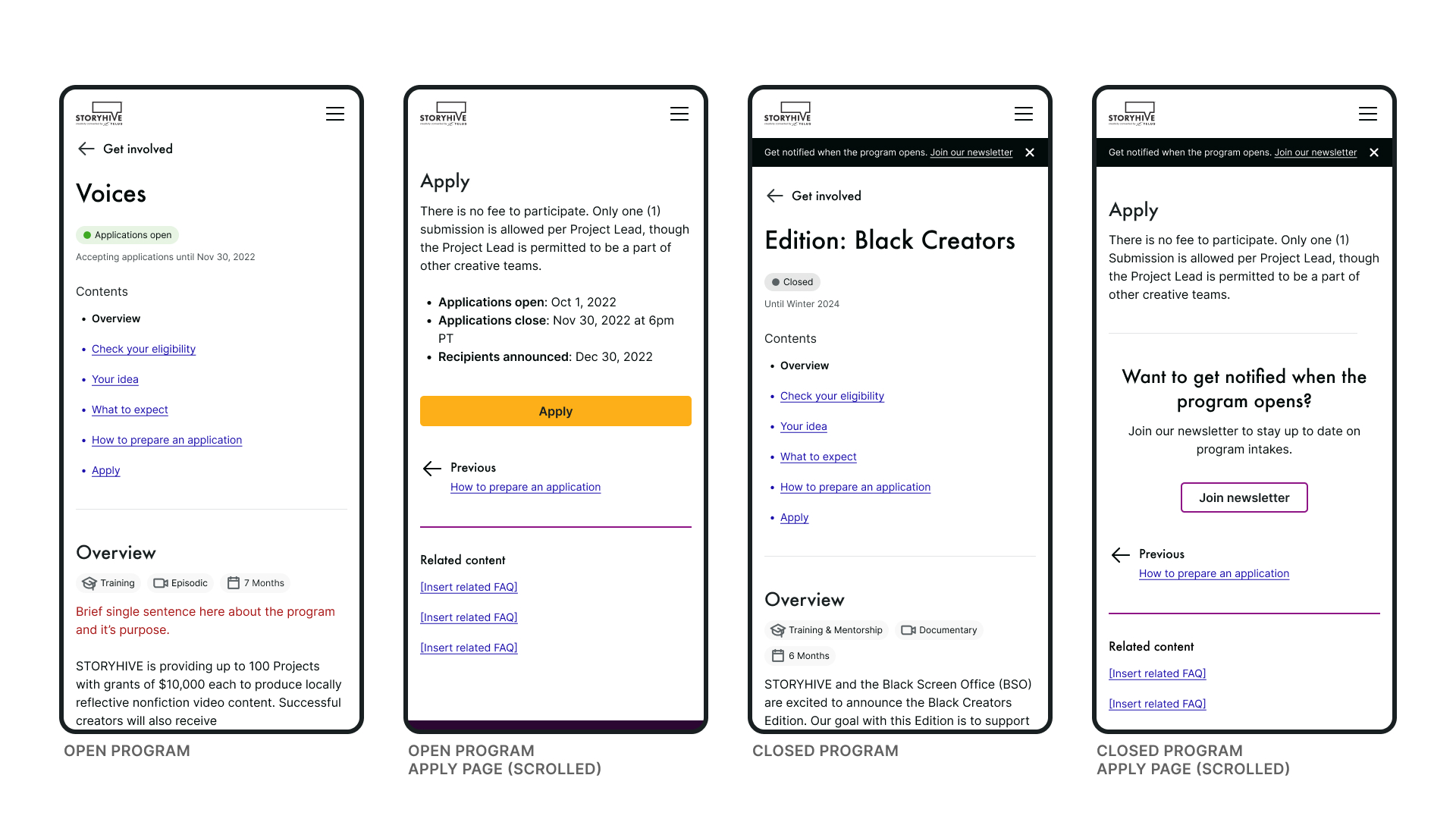
Program page
When a user clicks in to learn more about a program, a newly designed program page surfaces information that was previously buried in FAQs, PDFs, and submission guideline pages. Expectation setting was previously a pain point for many creators and survey results shared various topics that ‘would have been nice to know’ before they applied. We structured the new pages to include this information.
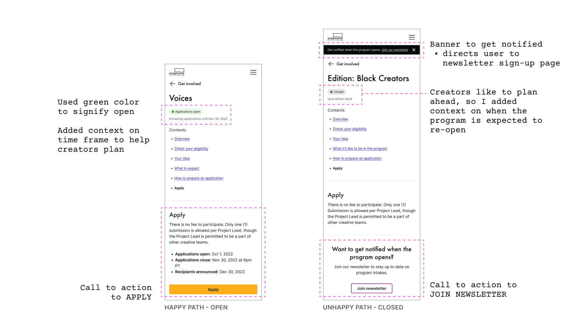
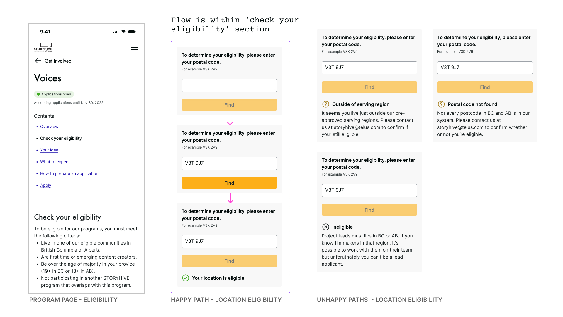
User testing found that when people visited the page, they were interested in knowing if it was open/closed, and if they were eligible. We designed ‘happy & unhappy’ paths for both experiences.
Programs redesign status happy & unhappy path
Programs redesign location eligibility happy & unhappy path
We designed program pages for each of the 7 storyhive programs. These pages required the most amount of copywriting. Due to our time constraint, I wrote and sourced as much information as I could and left text in RED and space to include imagery/videos with headings to guide writing that would need to be completed after this engagement.
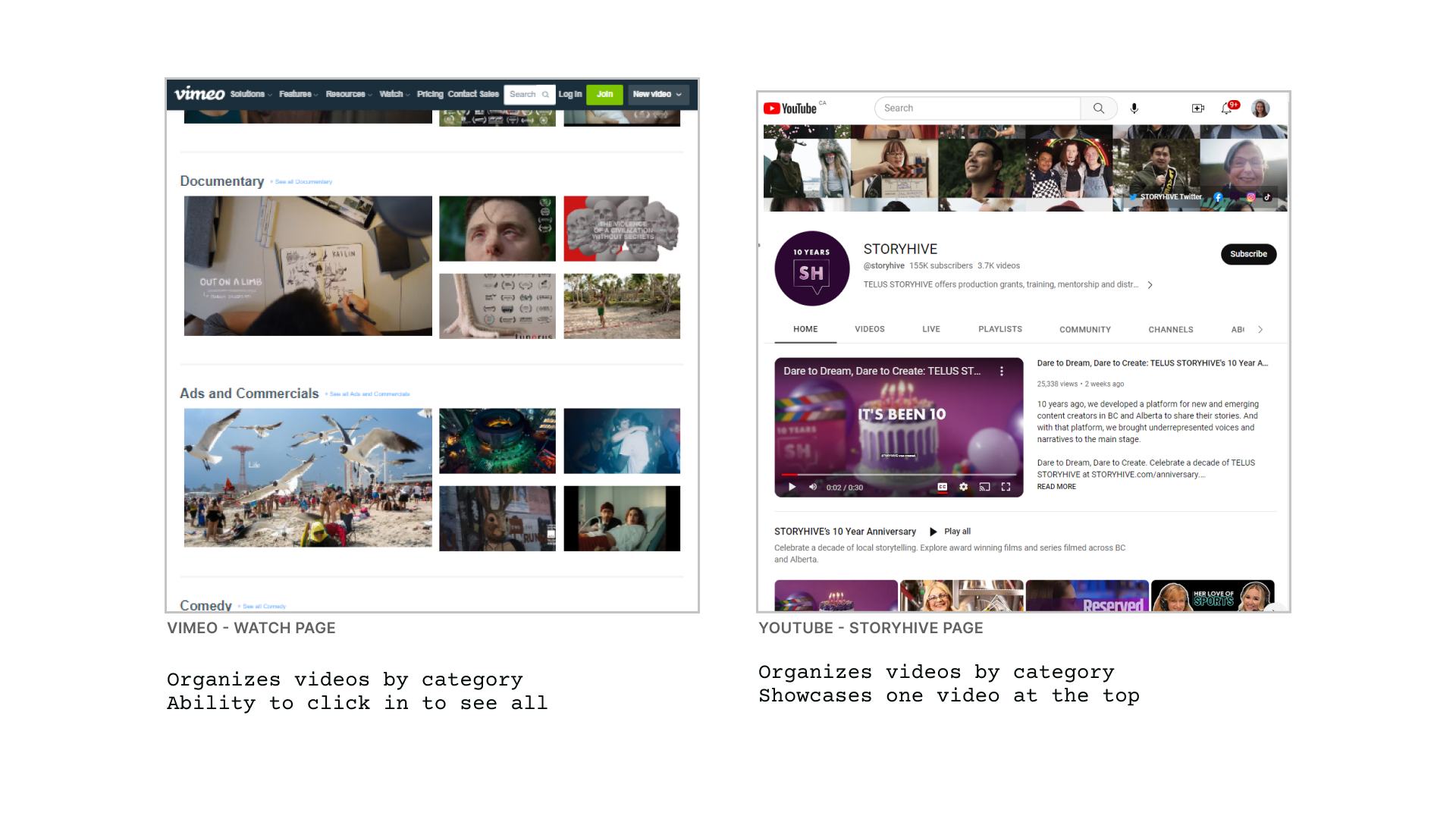
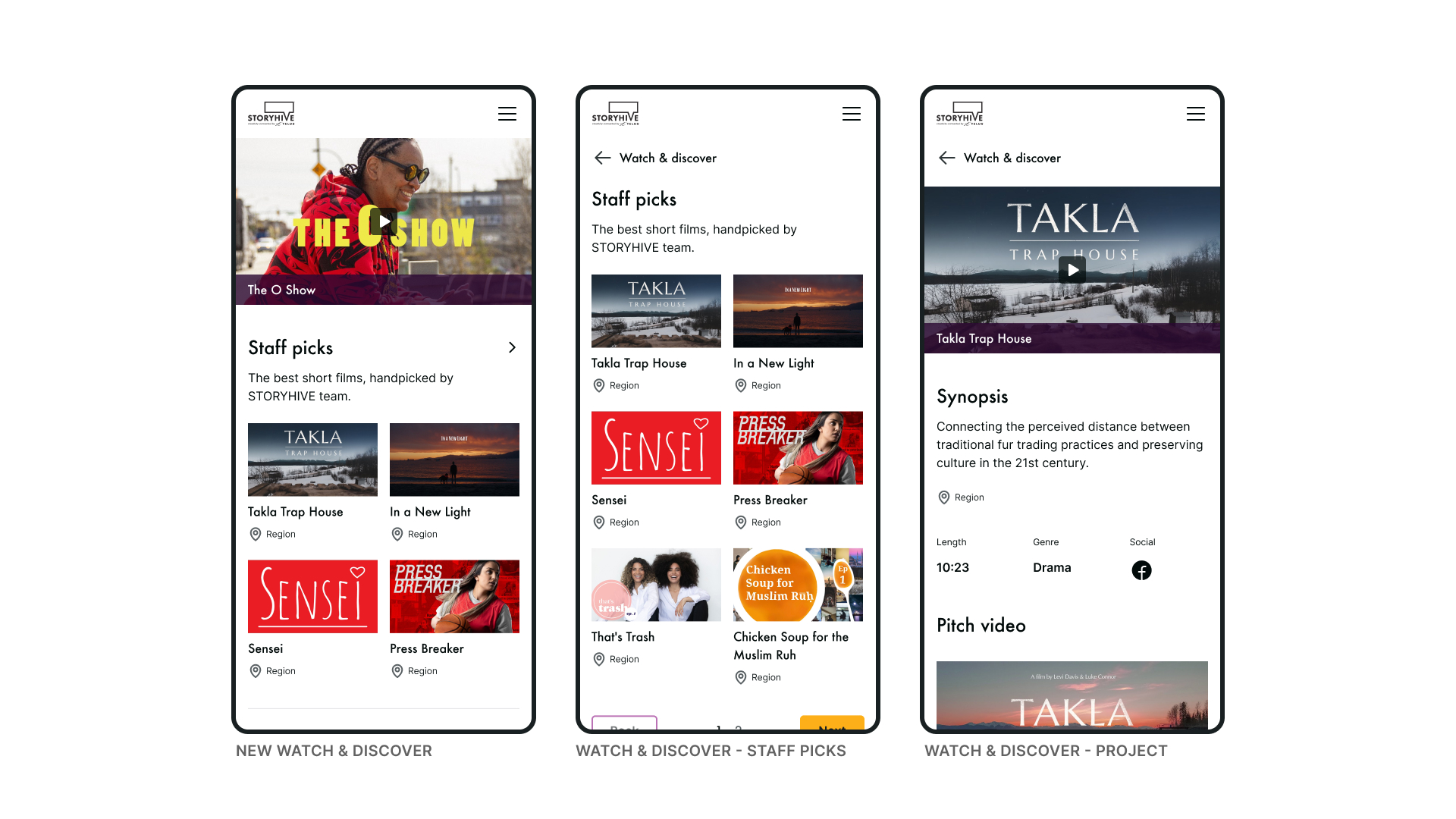
Watch & discover
The previous website had video content scattered across various pages. A new ‘watch & discover’ page was added to the website to consolidate all of the content into one page. The page offers strategically chosen and mixed content, and would be similar to their YouTube channel. During user testing, we found that ~23% of participants navigated to this page when tasked with learning more about SH programs. They showed delight when they could easily find key areas of interest.
Watch & discover inspiration
As a content creator, I want to find out more about STORYHIVE, so that I know who I’ll be working with
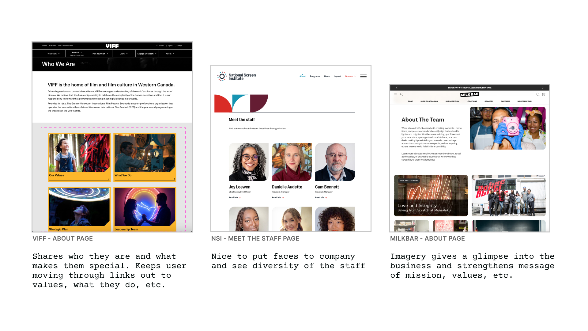
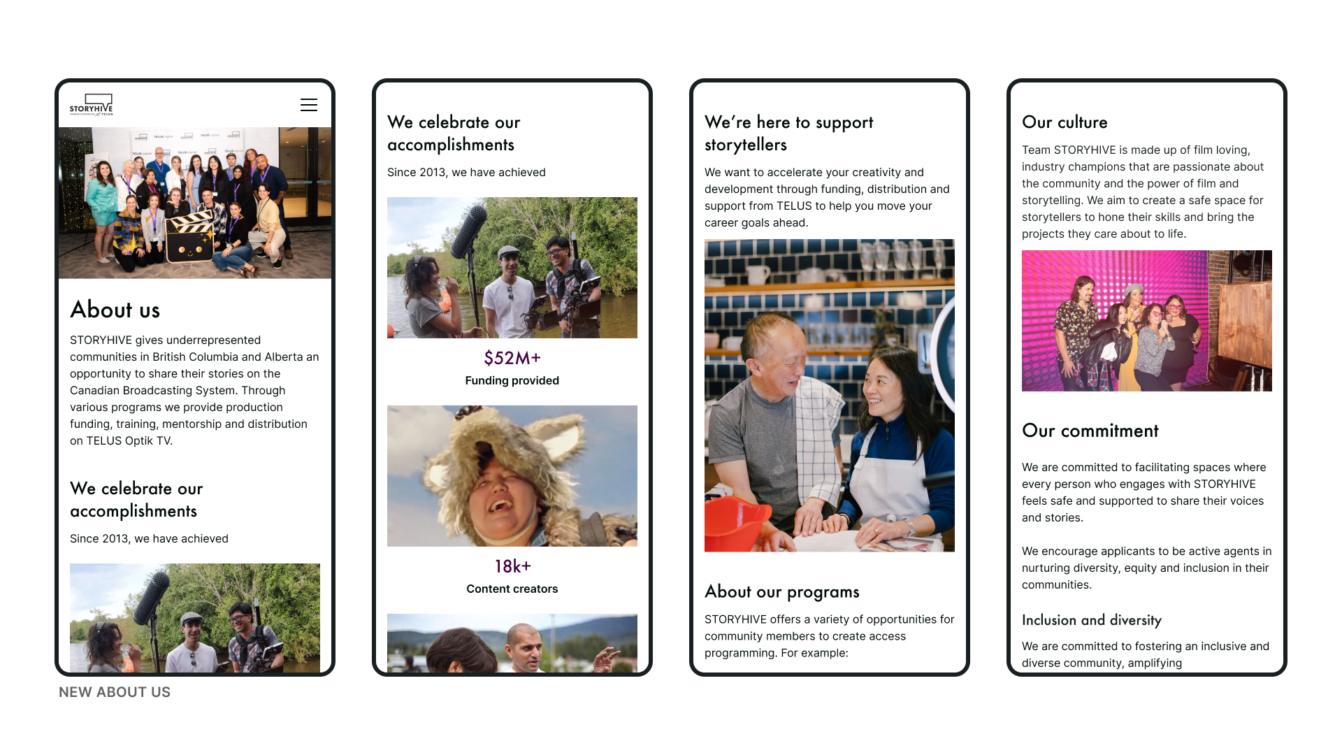
About us
Who runs the programs? What’s the culture like? What are their values? Why do they fund films? What’s the difference between programs?
These were common questions that the website was not answering. To help visitors learn more about SH, I revamped the About Us page to include information on their story, values, programs, culture, and team. I also added creator testimonials and diverse imagery to convey transparency and authenticity. User testing feedback found the new page to be a delight moment for many users who liked seeing the diversity of the team and reading more about the company.
Results
Presented the final design to SH and TO teams. The final designs included ones shared in this case study as well as user flows tailored to other SH audiences.
Due to the time constraint, the design included some placeholder content including images and text which were not finalized during this engagement. It was important to call-out these areas as ‘next steps’ for the SH team to complete before implementation.
✅ Increased TO and SH team awareness of weaknesses and opportunities for optimization, as well as bridges between cross department efforts
✅ Future-proofed website that supports business and user needs
✅ 70+ screens, 26 new pages, with key screens designed in desktop
Design system
The final handover included more than 70 desktop and mobile screens covering home, about us, programs, Optik TV, eligibility, and more.
A challenge when I started this project is that I did not have many design assets from the original website to work with, so I was often in Chrome ‘inspect’ panel looking for colors, type, imagery, spacing, and responsiveness. I wanted to re-use as much of the original website assets as possible, to make it easy for development.
I built a design system of reusable components and their states, such as cards, list items, buttons, menu, and tokens. I aimed to maintain design consistency and recognizable UI patterns for the user.
Learnings
This was my first time working as a freelance designer and it was extremely rewarding. I experienced managing multiple stakeholders including the design agency and client. I also enjoyed the fast paced environment and ability to work on so much of the platform over a short engagement.
I was pleased to see that SH used the designs to inform the direction of storyhive.com. I’m excited to hear more about their platform as they grow!