Contents
Zoom is a cloud-based video conferencing platform that allows people to connect virtually. As a recognized leader in its market, individuals, businesses, and organizations use this platform globally. In 2020 when this project was done, the app had over 100 million downloads and a 3.7/5⭐ rating in the Google Play Store.
This case study offers a heuristic evaluation and proposed redesign for the Zoom mobile app, focusing on the ‘Start a Call’ task. It was a team effort where I had the pleasure of partnering up with a fellow UX designer, Tiffany Yap.
Project Type: Academic
Timeline: 3 weeks
Why redesign Zoom?
With the pandemic shifting much of education, work, and social gatherings online, platforms such as Zoom, GoToMeeting, and Microsoft Teams have boomed in popularity. For myself, this shift meant going from dressing up and seeing people face-to-face to attending meetings in my PJs and dreaming of being in Hawaii with my virtual background of waves crashing behind me.
Tiffany and I shared a love-hate relationship with Zoom as we used it both for university and our UX Design program. We saw opportunities within it where even slight tweaks could enhance the user experience. Further recognizing the business consideration that video-conferencing technologies are increasing in popularity, we wondered how we could go about giving Zoom the facelift it needed to stay ahead?
 Meme by @HlessHman
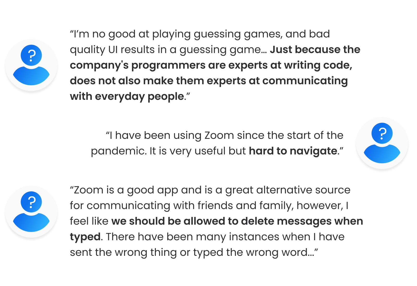
When scrolling through Zoom’s reviews on the Play Store, we realized that we weren’t alone with these feelings. Here’s what some other users had to say about the app:
 Zoom Google Play Store Reviews
Design process
This project was completed in 2 parts with the heuristic evaluation done first before the redesign.
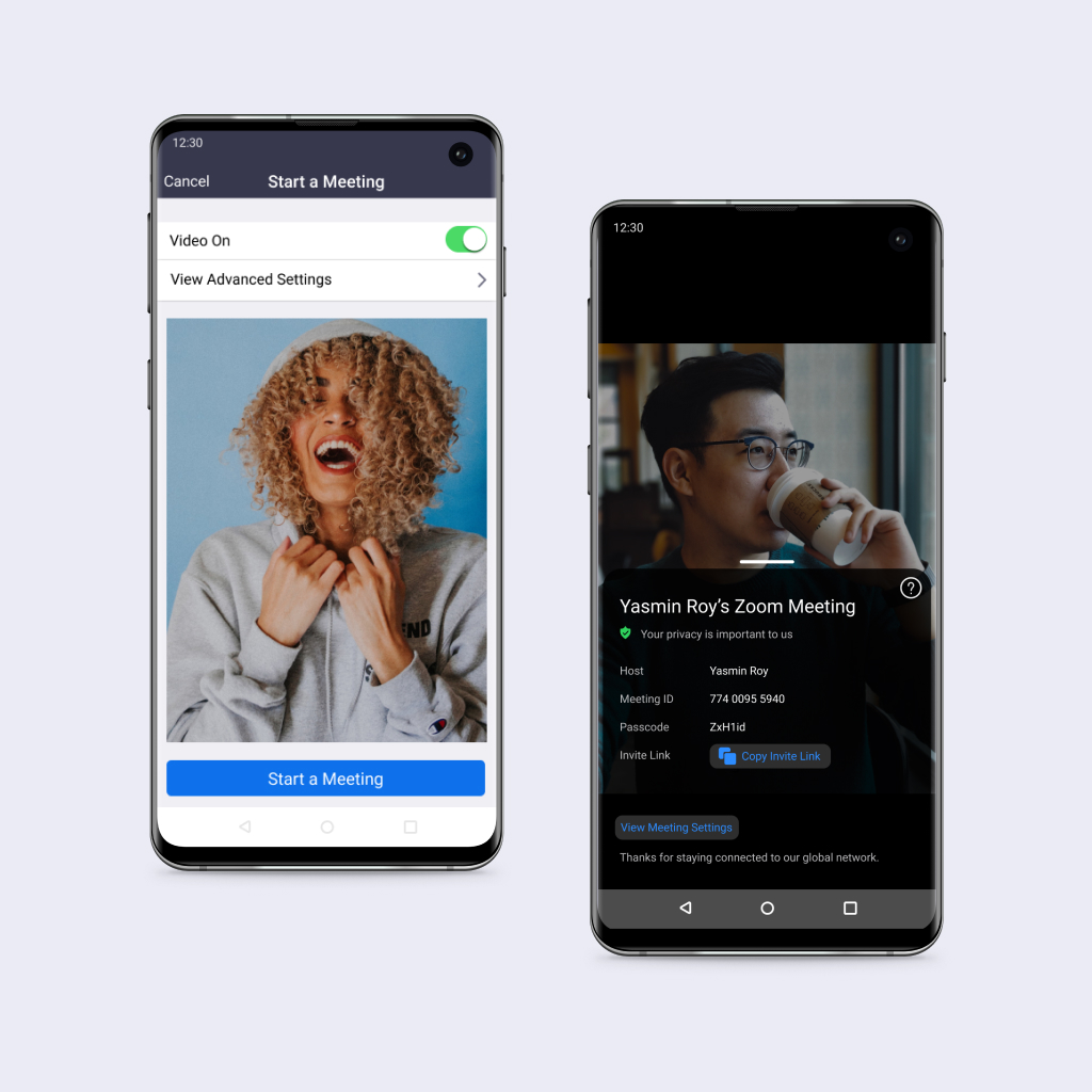
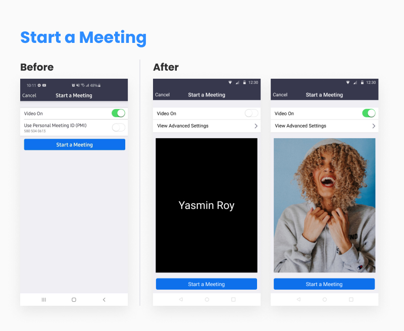
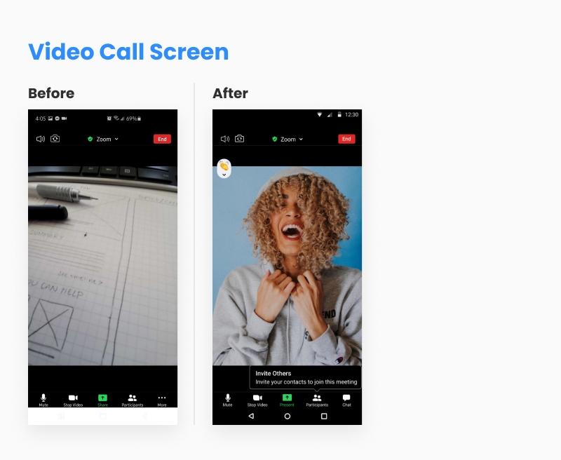
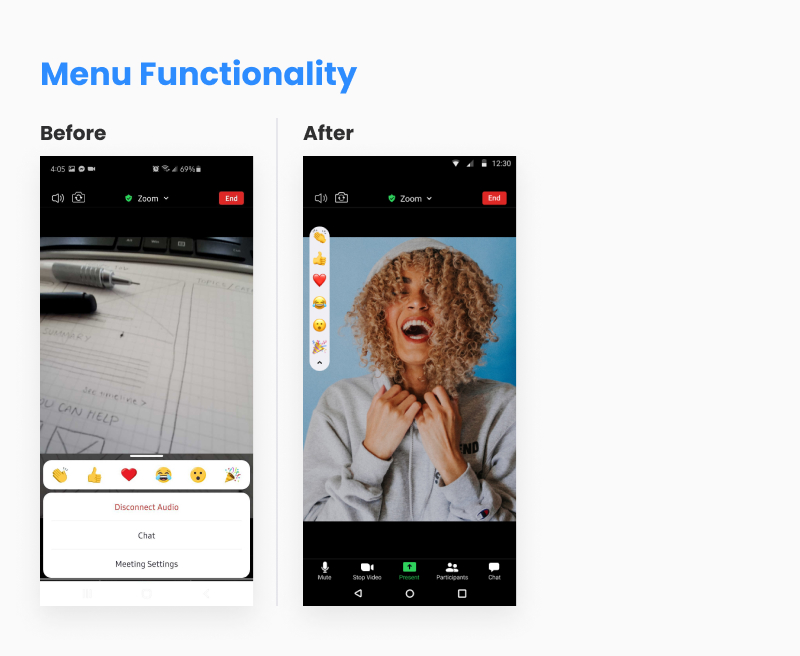
The task flow of ‘starting a call’ followed the scenario of our user Tiffany wanting to start a call with her sister who would like to share her screen during the call. The current flow of how Tiffany would accomplish this task can be seen below.
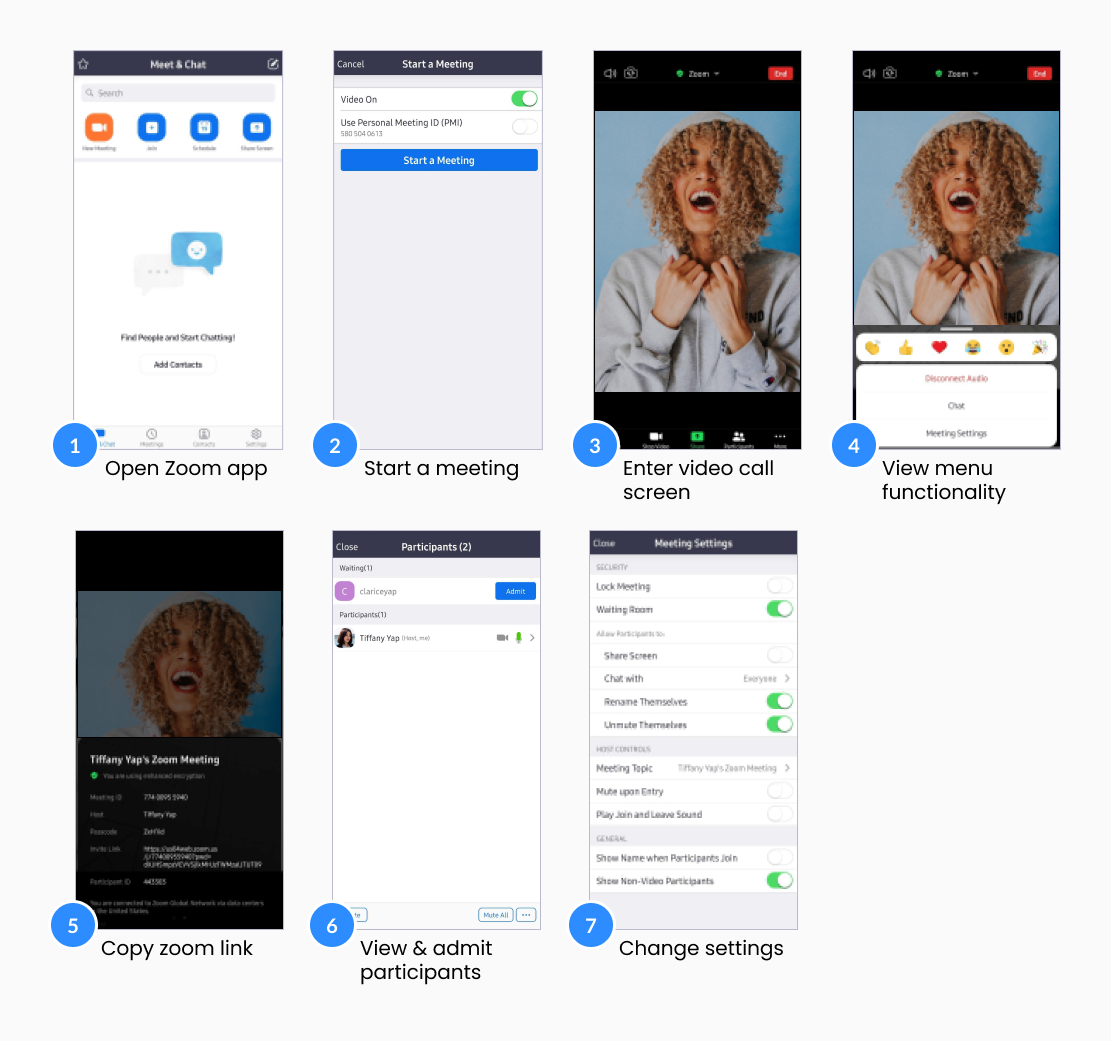 Current Start a Call Task Flow
Heuristic evaluation
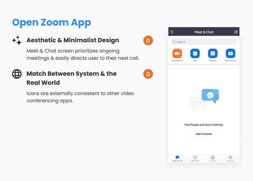
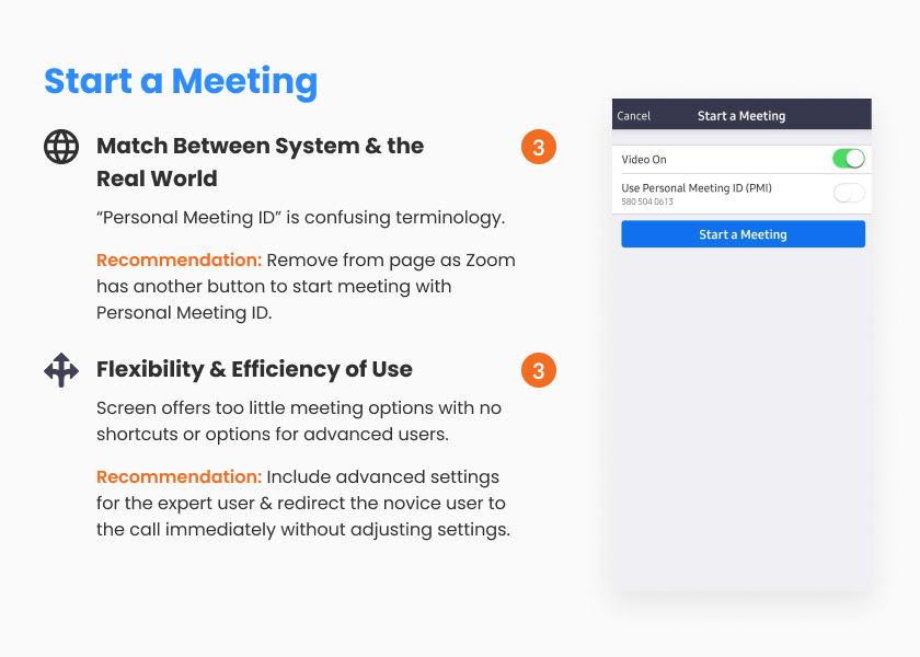
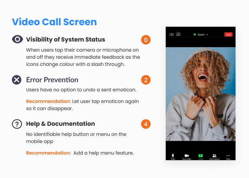
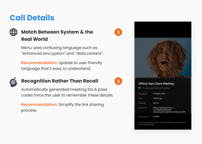
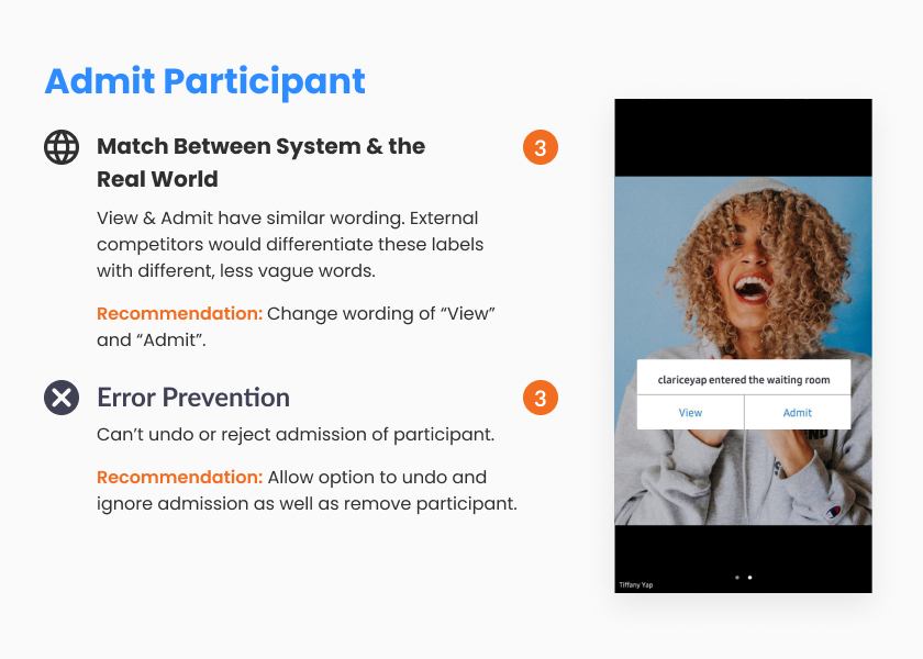
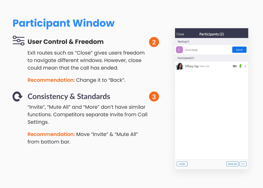
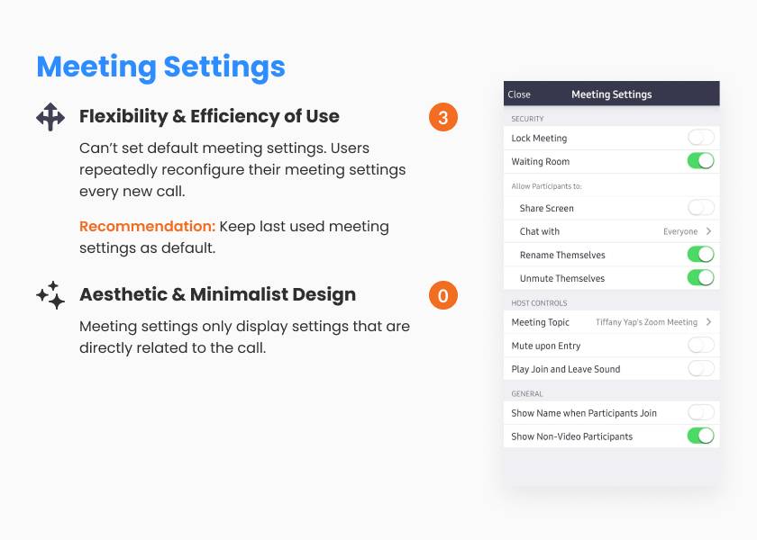
We used 9 of Nielsen Norman’s 10 Usability Heuristics to evaluate the usability of the ‘setting up a call’ task flow. Each heuristic was then rated using a scale of 0-4, 4 being a usability catastrophe.
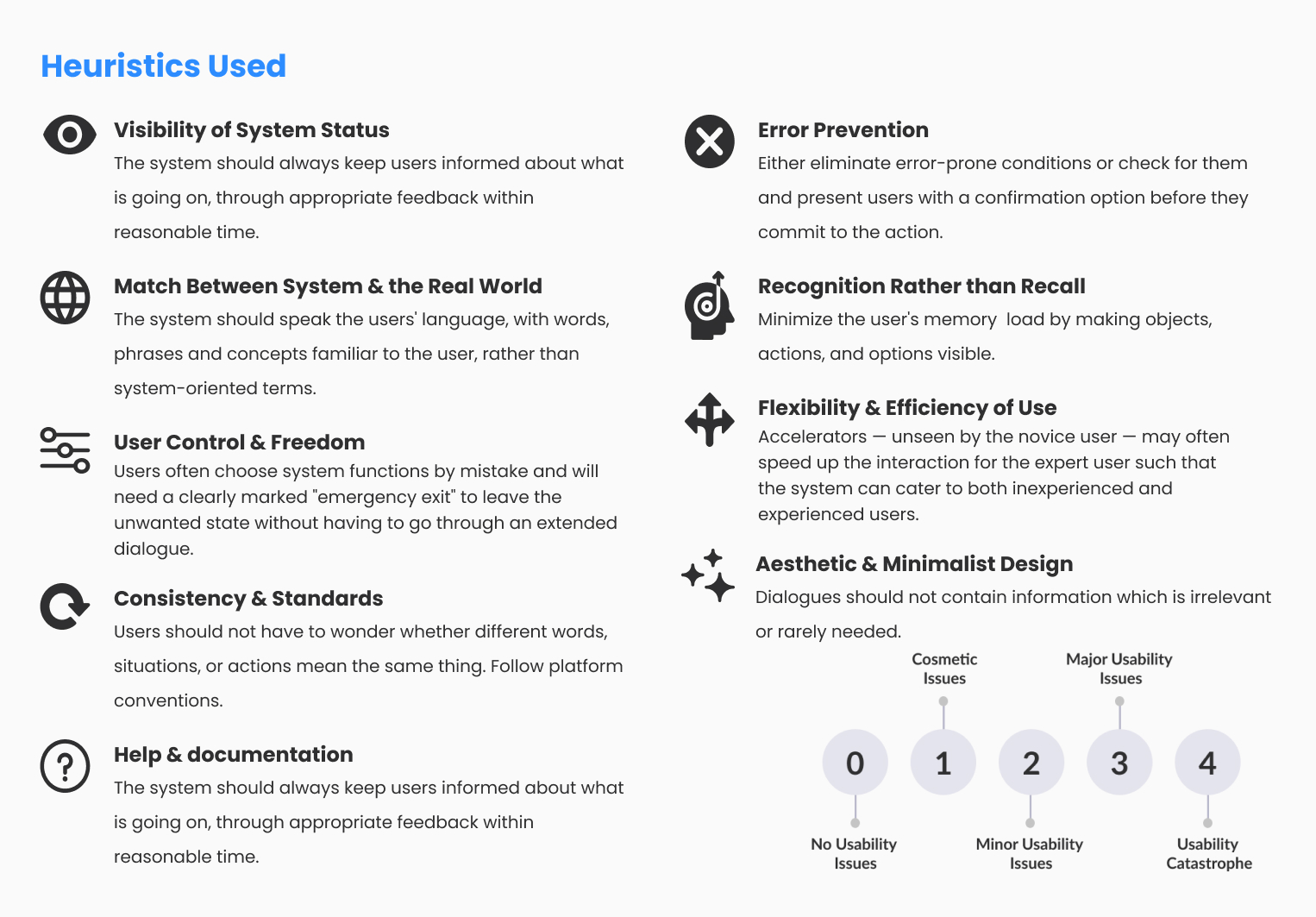 Heuristics and severity scale
Heuristic evaluation involves having a small set of evaluators examine the interface and judge its compliance with recognized usability principles
– Jakob Nielsen
Redesign
Tiffany and I presented our heuristic evaluation to educators and peers and were given the green light to move forward with the redesign. To help us decide what to tackle first, we created a prioritization matrix that looked at the impact versus effort to implement each design recommendation. Given our project time constraint, we tackled high impact changes first before moving onto changes that didn’t add much value to the user.
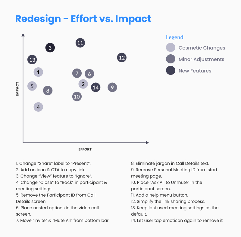 Redesign - effort vs. impact
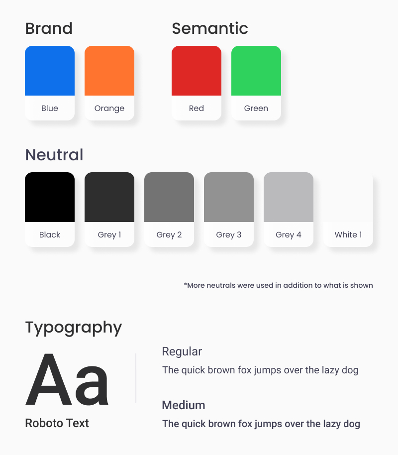
Next, we created a style guide as we wanted our redesign to closely match the app. During this process we noticed that Zoom uses many different shades of greys and blues throughout the app, some of which look very similar to each other. The app also didn’t seem to follow a grid or layout system. Since this wasn’t our focus for the project we decided to keep these as is and recommend for future redesigns to consider simplifying the colour palette and add in a grid or layout system to create a more cohesive design.
 Redesign - effort vs. impact
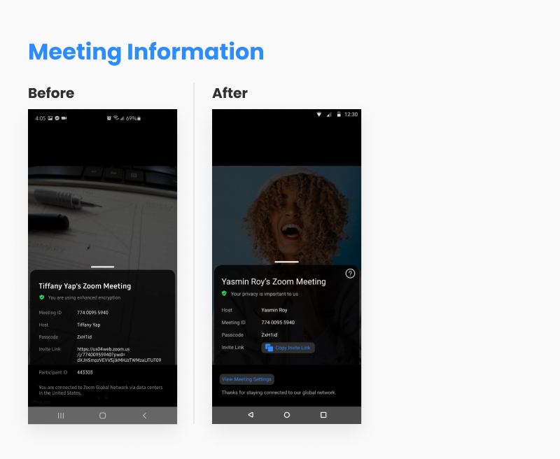
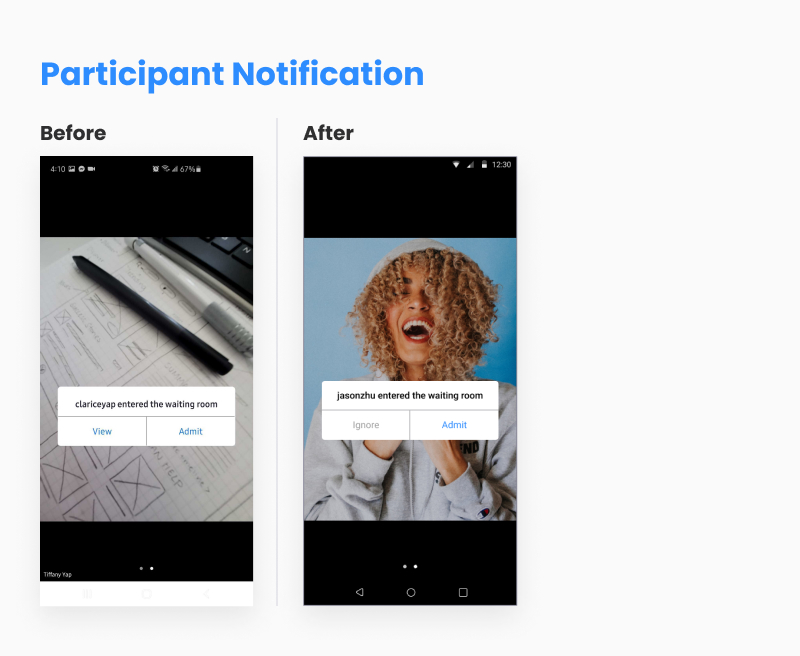
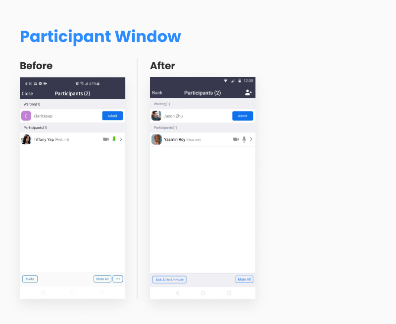
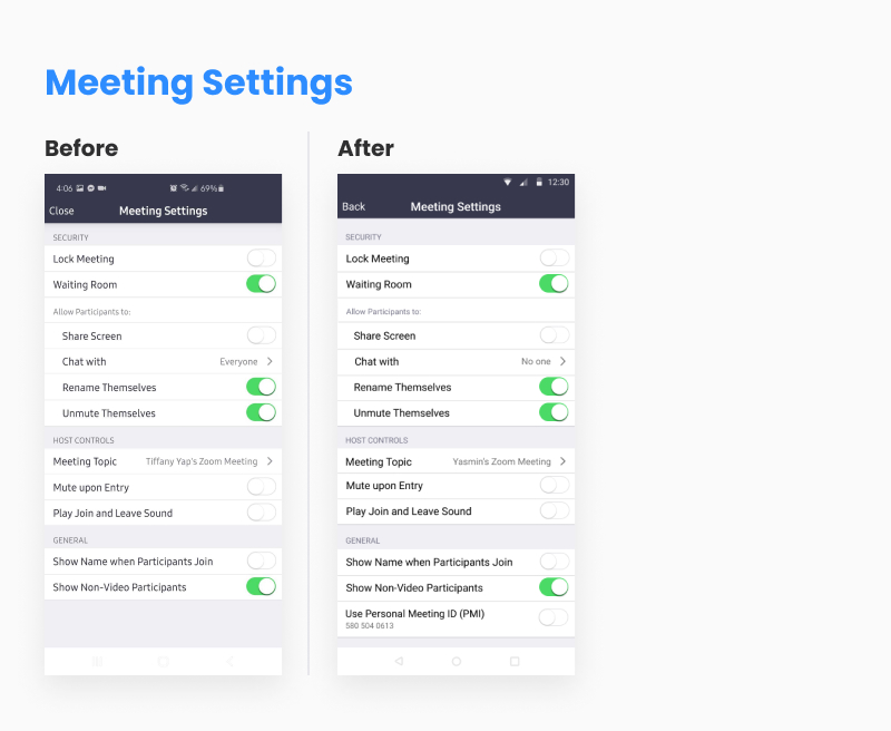
Result
Reflection
After 3 weeks of late night chats and working away on Figma, Tiffany and I presented our Zoom redesign to educators and peers where we received very positive reviews.
Excellent learning opportunity that taught me how to critique the usability of a design based on pre-established principles. Using NN’s Heuristics, I learned how to objectively evaluate Zoom’s mobile app in order to find opportunities to create a more usable product.
I learned the importance of creating and utilizing a design system. Before starting our redesign, Tiffany and I prepared a document of colours, typography, icons, and other elements that helped us design more effiently and be cohesive.
If you want to learn more about this project, please feel free to get in touch!
