Online grocery shopping: A new way to get my food
Like many foodies, one of the most pronounced changes in my lifestyle early in the pandemic was my diet. Specifically, where I went for food and how I bought my groceries. Getting food was no longer as simple as walking a few blocks and entering a physical store or restaurant.
Like me, many of my fellow Vancouverites had to change their grocery shopping habits: from buying in-store to buying online. As a result, it’s no surprise to hear that the online grocery market was one of the main digital beneficiaries during the pandemic. This is due to shoppers wanting to avoid public places, government orders to stay at home, and the continued need for groceries and essential goods (Keyes, 2021).
Us consumers were pretty fortunate though, since many options suddenly became available to buy food online (groceries and takeout). To name a few, Walmart, Costco, HelloFresh, Instacart and Real Canadian Superstore emerged as popular options to buy groceries online in Canada.
Buying groceries from my local Superstore, online
My family has shopped at Real Canadian Superstore for as long as I can remember. When I decided to make my first online grocery order, I chose to buy from a store I knew well. While I was able to accomplish my task of ordering groceries, I noticed so many opportunities within the process for design intervention that would have allowed for a much smoother buying process. This post aims to evaluate the product page specifically as I experienced the most friction here.
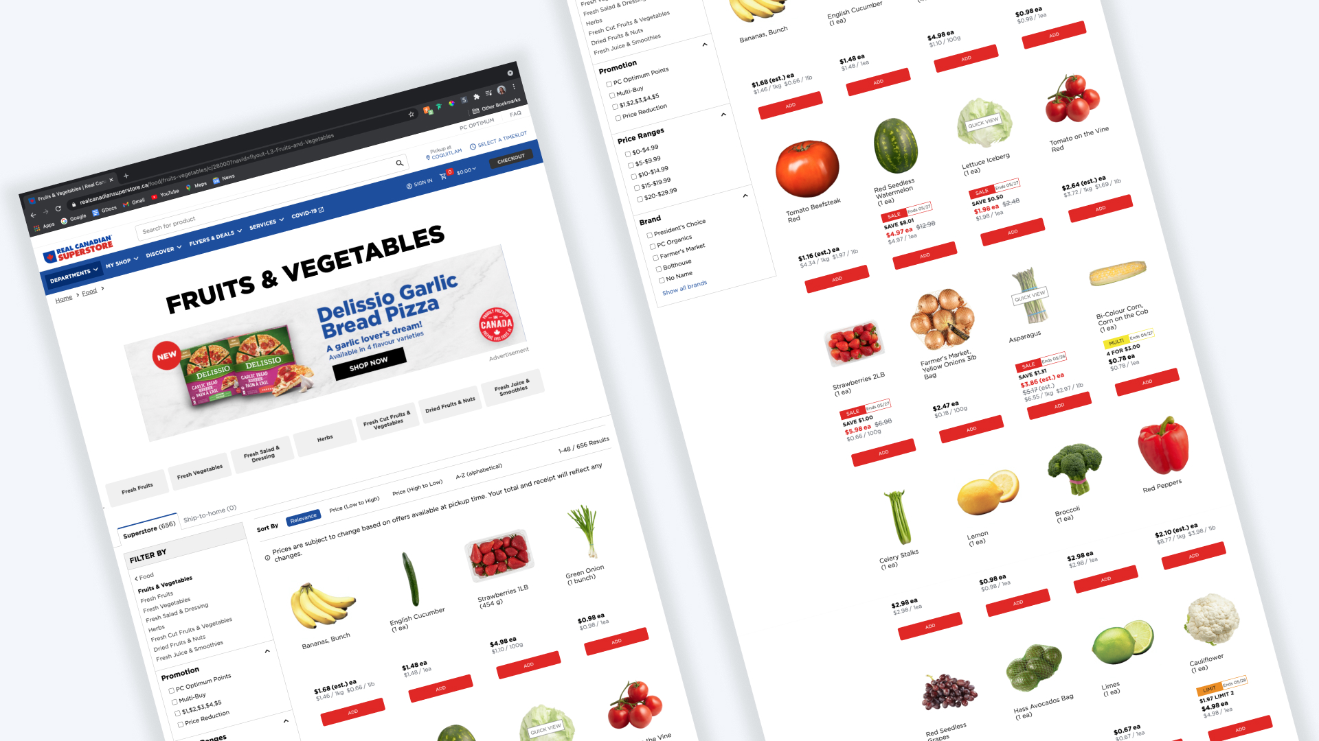
Evaluating experience opportunities at Superstore
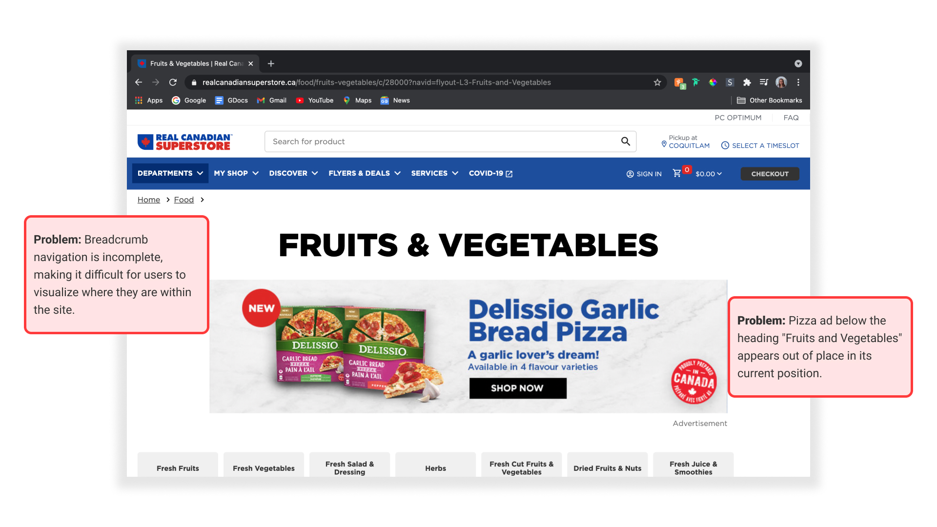
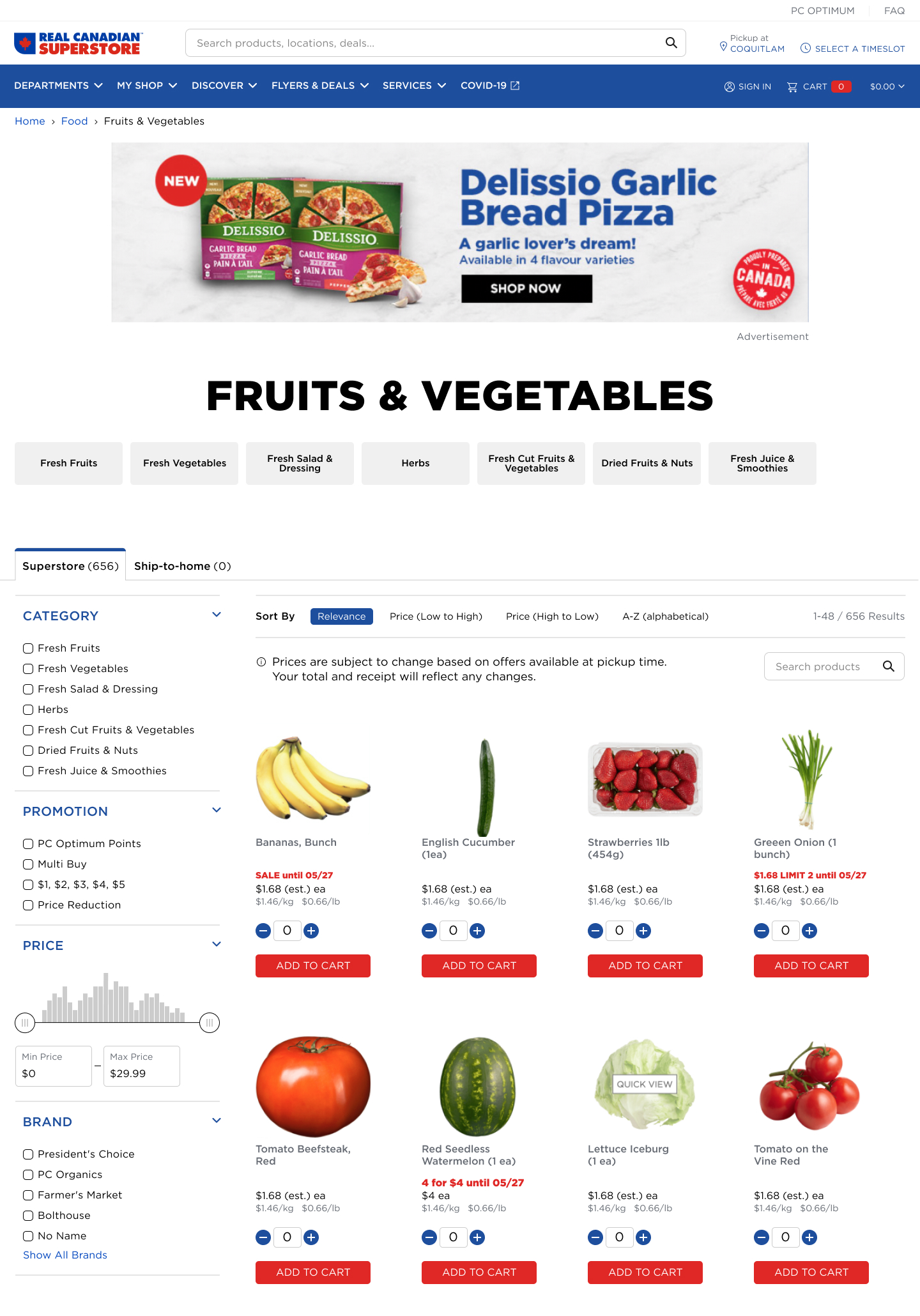
Problem 1: Pizza ad below “Fruits and Vegetables” heading appears out of place in its current position.
Hypothesis: If the pizza ad moved from its current location then users would know they are on the right page because their fruits and vegetable products would logically follow the header.
Recommendation: Assuming the ad brings significant revenue to the website, it would be ideal to keep it near the top of the page before the user scrolls. Rather than being directly under the Fruits and Vegetables header, consider placing it above so that there is a logical flow of header and then products.
Expected Result: Increase the % of visits to Product Display Page (PDP).
Problem 2: Breadcrumb navigation is incomplete, making it difficult for users to fully visualize where they are within the site.
Hypothesis: If there were the added granularity of “Fruits and Vegetables” then users would be able to understand better where they are on the site because of the clear flow shown.
Recommendation: Add breadcrumb granularity (e.g. Home > Food > Fruits & Vegetables).
Expected Result: Lower the exit rate on product listing pages (PLP).
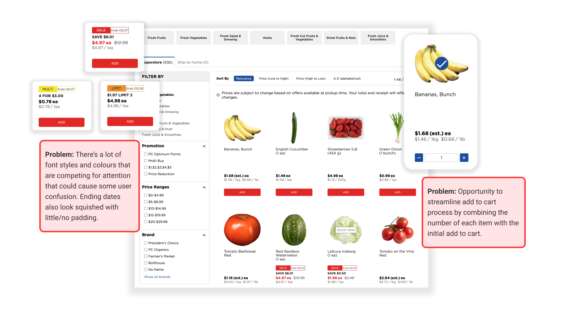
Problem 3: Opportunity to streamline add to cart process by combining the number of each item with the initial add to cart.
Hypothesis: If users could select the number of each item they wanted before clicking ‘ADD’ then they are likely to buy more of each item because it’s all in one simple step.
Recommendation: Allow user to select the number of an item they want before clicking ‘ADD’.
Expected Result: Increase the Add to Cart Rate.
Problem 4: There’s a lot of font styles and colours that are competing for attention that could cause some user confusion. Ending dates also look squished with little/no padding.
Hypothesis: If the design of the sale, multi, and limit labels are simplified and font styles are reduced then users will have an easier time finding the information they need because there will be less visual noise that competes for their attention.
Recommendation: Update labels and simplify font styles.
Expected Result: Increase in Revenue Per Visit.
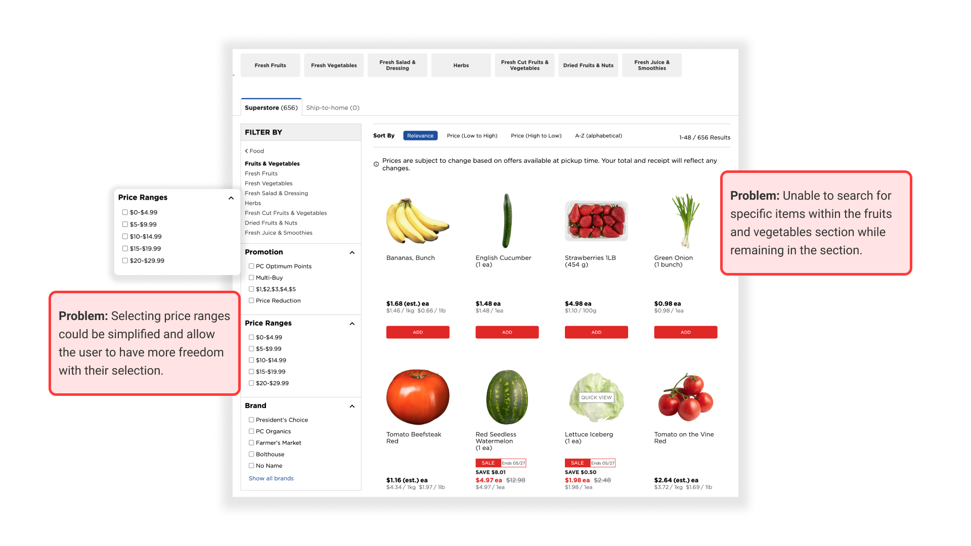
Problem 5: Selecting price range bins is simple, however it can become challenging for users who want to view products across multiple selections.
Hypothesis: If the price ranges section were updated to a slider then users would be given more freedom to select their desired range because they wouldn’t be stuck with the set ranges of $0-$4.99, $5-$9.99, etc.
Recommendation: Update price range section to a slider.
Expected Result: Increase in usage of price range section as a method to filter products.
Problem 6: Unable to search for specific items within the fruits and vegetables section while remaining in the section.
Hypothesis: If a search feature were added within product pages then users would be able to locate items they want with more ease because they would not have to scroll through the page (potentially 656 results) to find what they are looking for.
Recommendation: Add a search feature within this section.
Expected Result: Lower cart abandonment rate
Redesign
Finally, it was time to redesign the page. In addition to making updates based on my recommendations, I made minor tweaks to the user interface to give the site a slight facelift.
If you want to learn more about this project, please feel free to get in touch!
